@dutchdevil83: your background image might look better now. Give it a try?
@Eoreh:
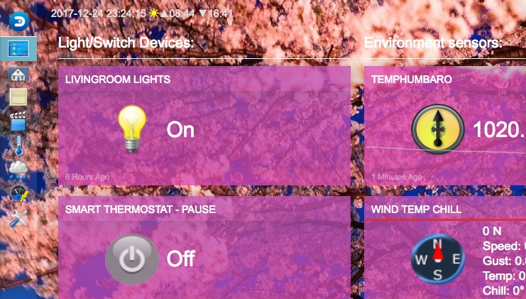
- Only the first three items in each section get highlighted. That's hard-coded, and a result of it being an older feature originally designed for a three-column display.
- When fuild item display is enabled, items will stretch to fit the space. This is normal.
- I've added an option to hide the titles. Even better, I've added an option to easily add your own CSS. Because I wonder how many people want this feature - I might remove it later. I'd ask people to share CSS snippets instead.
- In merged items the timestamp is shown for the first item the script comes accross. So you can change the timestamp by shuffling your items before you enable the merger feature. While technically possible to copy the timestamps into the 'main' item too, I'm not planning on adding that at the moment.
- bug:(5) - I can't help you there. It is based on the output by Domoticz. That changed recently.
- I've made the datavisualisation color less pronounced (6).
@jeanclic:
- Not having the pictures for weather is related to the french translation, you're right.
- The theme follows the rules about battery output display. I've also noticed that items without a battery get a battery icon anyway. This means Domoticz is outputting valid battery data for them. In theory, a battery level of 255 means it doesn't have one, and values between 0 and 100 mean it does. The script only shows battery output on items that follow these rules.
- It would be possible to show both the timestamp and the time-ago time on an item. You/someone/me can create some CSS rules for that, and add that in the CSS field in the theme settings.
- It would be possible to always show the battery percentage. Same story as above.
- To all the other questions the answer is pretty much "sorry,no". It is really hard to theme Domoticz because the output is so messy. It took a lot of work to get here, and changing things like the postion of elements is not easily done. Also, try to scale your browser window. You'll find that it works on all sizes, and repositions and scales elements to optimally make use of screen space. But that also creates constraints in where things can be placed. Also the item footer is not always visible: users can turn it off. For example, I can't place a button for the datavisualisation in it: sometimes datavisualisation is on, but the footer is off.
- I've made the selection boxes a little smaller. Originally I created some visual toggle switches (which, ironcally, have made it into Domoticz already), but I stopped using them.
How do you get that popup on the floorplan? Weird how that escaped all styling

About the translation: that would rock. In theory translation is possible (the proper codes are in the html). But I don't know how all that works, who you have to talk to about that.
@TiXav: thanks, I've incorporated your code.
@dextm80:
- I've modified the data output that used comma's.
- Only three items are highlighted. That's hardcoded into the theme. Originally, the theme tried to do everything with CSS only. If you want to change it, hack the file "dashboard_highlighted.css" and change all the ":nth-child(-n+3)" into ":nth-child(-n+5)", for example.
- I've modified the merging code do that it doesn't allow the merging of complex items. It was designed to merge items with single sensor data output.