Page 1 of 1
Custom Graph for Utility
Posted: Sunday 03 January 2016 17:10
by jurgen
Hi All,
In the menus of domoticz we have Temperture which has a functionality called " Custom Graph" but in the Utility we don't have that option.
I would like tot combine two or more different sensors in one graph and save that custom graph on the dashboard.
I have a sensor for a Smartmeter and a sensor for my solar panels which gives me two different graphs.
Is this functionality on the roadmap or is it possible to create one with a custom script?
Thank you!
Re: Custom Graph for Utility
Posted: Sunday 03 January 2016 17:26
by macieiks
That would be also perfect feature for me - comparing two energy meters with gas meter. Looking forward for it.
Cheers
Re: Custom Graph for Utility
Posted: Wednesday 13 January 2016 10:26
by jurgen
Hi All,
Does anyone know how to combine utility graph's?
Re: Custom Graph for Utility
Posted: Tuesday 15 November 2016 15:41
by Silenus
This still doesn't seem available in v3.5877.
I even think it's useful to combine graphs of everything you have data for.
For example:
I want to make a combined graph of the Switch "Nest HeatingOn" and Temperature "Nest".
Combining those 2 will give me a graph where I can see the temperature change after the Nest turned on the heating.
Re: Custom Graph for Utility
Posted: Tuesday 15 November 2016 17:13
by Mike
In an attempt to improve my heating control script I have a dummy Temperature sensor that gets updated with the Thermostat Setpoint (utility) to be able to plot a chart like this
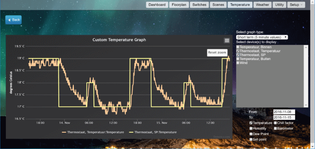
- temp util.png (128.25 KiB) Viewed 6763 times
would be nice to see gas consumption or boiler on-time in the same chart but they would need a second Y-axis
if domoticz could produce more options to plot combined data for analysis that would be great!
Somewhat in line with this,... When I click on a custom sensor icon on the floorplan I get a blank page, and not the log as for any other temp/weather/utility sensor.
In your case Silenus, you could update the dummy sensor with a value of say 17 when off, and 22 when on.
Re: Custom Graph for Utility
Posted: Tuesday 15 November 2016 20:30
by Silenus
Mike wrote:In your case Silenus, you could update the dummy sensor with a value of say 17 when off, and 22 when on.
Good point, I created a small LUA script which updates the value of the dummy sensor to the Nest Setpoint value.
Still, it would be useful to combine any other data in the same graph.
I've seen graphs in Domoticz where they use multiple Y-axis on the left side, but I can't recall where though.
If I found it again I'll post it.
Edit: It actually was on the Custom Graphs page for Temperatures
Re: Custom Graph for Utility
Posted: Thursday 24 October 2019 7:34
by Patricen
Hello,
On the custom graph page, there is a setpoint value check box, but I have no idea how it is operating. Any idea?