Page 1 of 1
Change GAS graph from Column to line graph
Posted: Thursday 07 October 2021 12:04
by MaxHipshot
Hi Guys,
I have Domoticz 2021-1 running
A Youless (LAN) device is added to retrieve P1 counters. Works like a charm.
Power (taken from network and delivered to network from solar) is represented as a line graph with multiple values. Love it.
Gas is presented as hourly columns in m^3 used.
I'd like to convert this graph to a line-graph with a 5 minute granularity, similar to the power graph.
Is this possible at all?
Re: Change GAS graph from Column to line graph
Posted: Thursday 07 October 2021 15:27
by waltervl
Sorry, not possible or use a custom sensor device but it has no history logging.
Re: Change GAS graph from Column to line graph
Posted: Thursday 21 October 2021 12:37
by MaxHipshot
Forgive me that I don't understand.
The data for KWH and M^3 is obtained from one single P1 device. "It is not possible" does not seem a reasonable answer
KWH is displayed as line graph for 24 hours, column graphs for historical graphs.
I would like the gas graphs follow the same design principle. LineGraph for 24hours, columns for history graphs.
Re: Change GAS graph from Column to line graph
Posted: Thursday 21 October 2021 13:10
by EddyG
I also think it is possible, but the heating does not use gas fluently in this time of the year every 5 minutes like electricity does.
So you will get a graph that will jump up and down to zero frequently. I don't think that will look nice.
I think that is why the developers decided to use columns.
But you can also use influxdb and grafana to make your own graphs, I did that.
I can tell you is does not look nice when the heating season starts.
Re: Change GAS graph from Column to line graph
Posted: Thursday 21 October 2021 13:40
by waltervl
It is indeed only possible if you reprogram the charting Js scripts or use an external charting application. So within Domoticz it is not configurable or easily changed. As it is software, everything is possible if you know how to do it.
Re: Change GAS graph from Column to line graph
Posted: Thursday 21 October 2021 15:31
by EddyG
It so happens that I still upload Gas data to my influxdb (on a Synology NAS in a Docker container) so I grasped a picture of the last 24 hours of my upload to influxdb. It is not so nice imho.
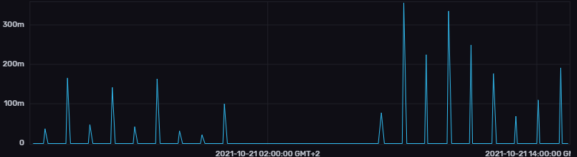
- 21.10.2021_15.25.53_REC.png (20.89 KiB) Viewed 896 times
Re: Change GAS graph from Column to line graph
Posted: Sunday 28 November 2021 14:51
by glipman
You may apply a tiny hack to domoticz\www\js\domoticz.js on your webserver.
In function ShowCounterLog() around line 5902 change line
to
and in line 5907 change
Code: Select all
$.getJSON("json.htm?type=graph&sensor=counter&idx=" + id + "&range=day",
to
Code: Select all
$.getJSON("json.htm?type=graph&sensor=counter&idx=" + id + "&range=day&method=1",
This wil change your hourly gas bar graph to a 5 minute line graph.
It indeed has many spikes as the heater is 'modulating' and my meter sends updates only once every 10 minutes but it is more detailed than the bar graph.
Note: whenever you upgrade the software in the future you may lose the patch (or it should make it into the core).