Many thanks, waaren.
(Re 'elegant': I just thought my python script was inefficient and clunky, and that there might be a neater way in dzVents.)
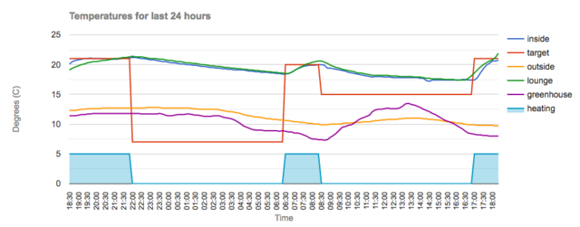
Here's an extract from the temperatures csv file [annotated with comments - not in actual file]:
Code: Select all
now, inside, target, outside, lounge, greenhouse, heating  [header row]
22:10,21.2,7.0,12.7,21.3,11.8,0   [oldest data: 24 hours minus 10 mins. ago]
22:20,21.1,7.0,12.7,21.3,11.8,0   [next data: 10 mins. later]
...
22:00,21.1,7.0,9.4,22.0,8.0,0     [latest data]
'now' is time; 'inside', 'target', 'outside', 'lounge', 'greenhouse' are all temperatures from Domoticz temperature devices.
'heating' is a dummy variable set in the script, with a value of 5 if heating is on (taken from a dummy switch) and 0 if off
- so that it appears on the graph as the shaded series.
There are 144 data rows (every 10 mins. for 24 hours), dropping the oldest row and adding the latest row to give the rolling 24 hour graph.
(I created what has turned out as a rather complex piece of javascript, which reads the csv file and calls Google Chart functions. This runs on an nginx webserver on my Domoticz server, called every 10 minutes by cron.)