Page 1 of 15

Multiple sources in one graph

Posted: Tuesday 03 December 2019 21:21
by ykuijs
I recently started using Dashticz and really like how easy it is to create a nice dashboard for Domoticz. I do have one question:
I have a temperature sensor in my thermostat and in my Hue motion sensor somewhere else in my home. By adding two graphs I can show the output of the two devices in different graphs.

However I would like to combine these outputs into one graph, consuming less space on my dashboard. Unfortunately so far I am unable to do so, since these are two different devices and I cannot find how to combine these into one graph.

Is it possible to show the output of two devices in one graph? And if so, how can I do that?

Thanks a lot for the help!

Re: Multiple sources in one graph

Posted: Wednesday 04 December 2019 16:39
by Lokonli
Currently it's not possible to combine the data from two devices into one graph. It's already on the Feature Request list.

Maybe a nice challenge for the next holiday :)

Re: Multiple sources in one graph

Posted: Wednesday 04 December 2019 22:37
by ykuijs
That is too bad. Fortunately it is a holiday at the end of this month :lol:

Would also be great to be able to add more than two devices. I would like to display:
  • the usage of all three phases of my P1 meter in one graph
  • the temperature of my thermostat, the outside temperature and the temperature of a Hue motion sensor elsewhere in my house into one graph

Re: Multiple sources in one graph

Posted: Thursday 12 December 2019 13:48
by webrazor
Just looking for this, would be nice to add more sources to one graph. I want to have one graph with multiple temperature sensors around the house.

Re: Multiple sources in one graph

Posted: Thursday 12 December 2019 14:09
by Lokonli
ok, challenge accepted.

Re: Multiple sources in one graph

Posted: Tuesday 31 December 2019 16:29
by jake
Currently I am monitoring my floorheating (to tune it) by using 6 temperature sensors: supply, return and 4 strings. Therefore, yes, count me in for a multiple sources graph. I now have to go to Excel to better view the relation between the 6 measuring points.

Another swipe on my Dashticz tablet to a summarizing graph would be very nice. Count me in!

Re: Multiple sources in one graph

Posted: Sunday 05 January 2020 23:35
by clinkadink
Had a play over the weekend. I managed to pull in various device data, combine it and show it on a graph.

The example below shows a multigraph with 3 devices; my server's CPU, memory and HDD. It is currently displaying the last month.

Image

The devices are applied to the block as follows:

Code: Select all

blocks['multigraph_17'] = {
	title: 'CPU, Memory & HDD',
	devices: [ 17, 18, 189 ],
        datasetColors: ['red', 'yellow', 'blue', 'orange', 'green', 'purple'],
	legend: true,
	graph: 'line',
	fill: false,
	legend: {
          'v1'		: 'CPU',	  
	  'v_avg1'	: 'CPU avg',
	  'v_max1'	: 'CPU max',
	  'v_min1'	: 'CPU min',
	  'v2'		: 'MEM',
	  'v_avg2'	: 'MEM avg',
	  'v_max2'	: 'MEM max',
	  'v_min2'	: 'MEM min',
	  'v3'		: 'HDD',
	  'v_avg3'	: 'HDD avg',
	  'v_max3'	: 'HDD max',
	  'v_min3'	: 'HDD min',
     }
}
It basically queries each devices, obtains the JSON data, merges it with however many devices specified (renaming duplicate keys with an index), adds to a new JSON file ... and passes that to the graph.

The example shows a multigraph displaying both my solar production, and my grid consumption.

Image

Code: Select all

blocks['multigraph_1'] = {
	title: 'Solar vs Grid',
	devices: [ 1, 162 ],
        datasetColors: ['rgba(92, 184, 92, 0.8)', 'rgba(217, 83, 79, 0.8)'],
	fill: true,
	graph: 'line',	
	legend: false
} 
You may notice that I have set the line graph to fill, also called an 'area chart'. I have configured the multigraph block to allow toggling fill on and off per multigraph. It is quite effective when using opacity and RGBA colours. The last value in RGBA is 'alpha' or opacity.

There is still work to do, but I thought I would share my progress so far ;)

Re: Multiple sources in one graph

Posted: Tuesday 07 January 2020 19:30
by jake
Looks good, for a minute I was under the impression that this was already availalbe, but I don't see anything in the release notes yet for version 3.3. I guess this is ongoing work and I'll have to wait a bit longer. No prob!

Re: Multiple sources in one graph

Posted: Tuesday 07 January 2020 20:15
by ykuijs
That indeed looks really good! Great work! Let me know if you need me to test anything.

Re: Multiple sources in one graph

Posted: Thursday 09 January 2020 21:11
by clinkadink
Thanks both. Yes, still being developed, although getting close now. There were quite a few unexpected challenges to overcome.

Some are listed below :?
  • What happens when one device has different time data to the other device(s)?
  • When using area charts (filled graphs), how do you prevent the smaller dataset being placed behind the larger dataset(s)?
  • How do you change the order in which the datasets are presented, and have a different order depending on Last, Today and Month?
  • How do you make a device only show some of its data, e.g. comparing 2 temperature devices, but one of them includes humidity?
  • How to scale correctly, so that a device with a small value (compared to others with large values) is still readable?

The good news is that I have solved most of these now ;)
  • The multigraph code now checks each of the devices time frames, and creates a time frame that caters for all devices.
  • I have also added 3 new properties called drawOrderLast, drawOrderDay and drawOrderMonth to control the order in which the datasets are added to the graph, for each of the time buttons. This is only useful when you want 'area charts' (i.e. graph = line, fill = true).
  • To exclude certain data from being returned from one or more devices, I have introduced the exclude property.
  • A new property has been added called cartesian to control the scale of the graph. Possible values are linear, logarithmic, category, and time.
I have specified the order in which the datasets are added in the multigraph below using the new drawOrderDay and drawOrderMonth properties.:

Code: Select all

blocks['multigraph_17'] = {
	title: 'CPU, Memory & HDD',
	devices: [ 17, 18, 189 ],
        datasetColors: [colourRed, colourOrange, colourBlue, colourGreen, colourBlueLight, colourAqua, colourYellow, colourPurple, colourPink],
	legend: true,
	cartesian : 'linear', 	
	graph: 'line',
	fill: true,
	drawOrderDay:   ['v1', 'v3', 'v2'],
	drawOrderMonth: ['v_min1', 'v_avg1', 'v_min2', 'v_max1', 'v_avg3', 'v_max3', 'v_min3', 'v_avg2', 'v_max2'],
	legend: {
          'v1'		: 'CPU',	  
	  'v_avg1'	: 'CPU avg',
	  'v_max1'	: 'CPU max',
	  'v_min1'	: 'CPU min',
	  'v2'		: 'MEM',
	  'v_avg2'	: 'MEM avg',
	  'v_max2'	: 'MEM max',
	  'v_min2'	: 'MEM min',
	  'v3'		: 'HDD',
	  'v_avg3'	: 'HDD avg',
	  'v_max3'	: 'HDD max',
	  'v_min3'	: 'HDD min'
    }
}
Image

Due to the low solar output in winter months, comparing solar to grid was often hard to read. I needed to update the graph to use a logarithmic scale, i.e. a nonlinear scale useful when analysing data with large ranges. My solar device stops recording data at the usual 5 minute intervals when it gets dark. So the new code inserts intervals (with a value of 0.00) when no data is recorded. In the updated multigraph block below, I use the cartesian property, and the three new drawOrder properties.

Code: Select all

blocks['multigraph_1'] = {
	title: 'Grid vs Solar',
	devices: [ 162, 1],
        datasetColors: [colourRed, colourGreen],		
	fill: [true, true],						
	graph: 'line',				
	cartesian : 'logarithmic', 				
 	drawOrderLast:  ['v2', 'v1'],
	drawOrderDay:   ['v2', 'v1'],
	drawOrderMonth: ['v1', 'v2', 'c1', 'c2'],
	legend: {
	  'v1'	: 'Grid',	
	  'v2'	: 'Solar', 
	  'c1'	: 'Solar Cumulative',	  
	  'c2'	: 'Solar Cumulative'
    }
} 
This is using the standard linear scale that we have today in Dashticz (i.e. cartesian = linear):
Image

This is using the new logarithmic scale (i.e. cartesian = logarithmic ). Note the y axis labelling on the left:
Image

My indoor temp sensor also includes barometric pressure (ba) and humidity (hu), but my outside one is only temperature. In the graph below, I use the exclude property to remove this unwanted data, so I can directly compare the temperature only.

Code: Select all

blocks['multigraph_72'] = {
	title: 'Outside vs Inside Temp',
	devices: [ 72, 152],
	datasetColors: [colourBlueLight, colourLightGrey, colourBlue, colourOrange, colourRed, colourYellow],
	exclude: ['ba', 'hu'],
	graph: 'line',
	legend: {
          'te1'	: 'Outside (max)',	  
	  'ta1'	: 'Outside (avg)',
	  'tm1'	: 'Outside (min)',
	  'te2'	: 'Inside (max)',
	  'ta2'	: 'Inside (avg)',
	  'tm2'	: 'Inside (min)'
    }
} 
Image

Hopefully, I am nearly there. I'll let the community know asap.

Cheers.

Re: Multiple sources in one graph

Posted: Thursday 09 January 2020 21:16
by ykuijs
Awesome!! I can't wait!

No pressure though ;)

Re: Multiple sources in one graph

Posted: Thursday 09 January 2020 21:23
by clinkadink
I will have to run it past Mr Dashticz first, @Lokonli, I know he's a busy man :)

Re: Multiple sources in one graph

Posted: Thursday 09 January 2020 23:24
by jake
Cool! Will uit also include line weight for the graphs? The examples show rather thin lines, although this shows the most detailed information!

Re: Multiple sources in one graph

Posted: Thursday 09 January 2020 23:31
by clinkadink
It can do, I'll see what I can come up with.

Re: Multiple sources in one graph

Posted: Saturday 11 January 2020 0:52
by clinkadink
I have added the ability to set the line weight for the graphs. And quite a few more settings too. Hopefully finish this weekend.

Re: Multiple sources in one graph

Posted: Saturday 11 January 2020 19:20
by clinkadink
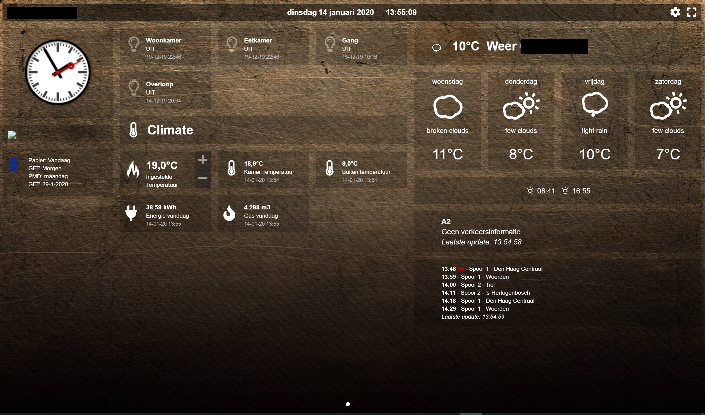
Ok, I think it's shaping up ...

Image

I have added new block settings for the multigraph (some will also work with the standard graph too):

01: devices - an array of the device ids that you want to report on, e.g. [ 17, 18, 189 ]
02: multigraphTypes - similar to graphTypes for the standard graph, an array of values you want to show in the graph, e.g. ['te'] (default is all)
03: interval - a time based limiter, to limit time data, e.g. 2 will show 1/2 the time labels, 5 will show 20% of the time labels (default is 1)
04: maxTicksLimit - specifies how many labels (ticks) to display on the X axis, this does not limit the data in the graph, e.g. 10 (default is all)
05: cartesian - scales the graph with standard 'linear' scale, or 'logarithmic', an algorithm to ensure all data can be seen (default is linear)
06: iconColour - colours the graph's title icons (default is grey)
07: lineFill - if line graph, this fills the graph, it is an array for each dataset, e.g.['true', 'false', 'true'] (default is false)
08: borderWidth - this is actually the width of the line (default is 2)
09: borderDash - use if you want a dashed line, it takes an array of two values; length of the line and the space, e.g. [ 10, 10 ] (default is off)
10: borderColors - handy for bar graphs, takes an array of colours like datasetColors, e.g. ['red', 'green', 'blue'] (default uses datasetColors)
11: pointRadius - the size of each data point, e.g. 3 (default is 1)
12: pointStyle - an array of the shape of each point, such as circle|cross|dash|line|rect|star|triangle, e.g.['star','triangle'] (default is circle)
13: pointFillColour - an array containing the colour of each point, e.g. ['red', 'green', 'blue'] (default uses datasetColors)
14: pointBorderColor - an array containing the border colour of each point, e.g. ['red', 'green', 'blue'] (default is light grey)
15: pointBorderWidth - the thickness of the point border, e.g. 2 (default is 0)
16: barWidth - if a bar graph, this is the width of each bar, 0-1, e.g. 0.5 is half bar, half gap (default is 0.9)
17: reverseTime - use this if you want to reverse your X axis, i.e. setting 'true' would mean the time will be reversed (default is false)
18: lineTension - sets the bezier curve the line is, 0 is straight, 1 is extremely curved! e.g. 0.4 gives a nice bendy line (default is 0.1)
19: drawOrderLast - an array stating the order in which each dataset should be added to the graph for "last hours", e.g. ['v2', 'v1']
20: drawOrderDay - an array stating the order in which each dataset should be added to the graph for "today", e.g. ['v3', 'v1', 'v2']
21: drawOrderMonth - an array stating the order in which each dataset should be added to the graph for "last month", e.g. ['v1', 'v2', 'c1', 'c2']
22: buttonsBorder - color of the buttons border, e.g. 'red', default is 'white'
23: buttonsColor - color of the buttons text, e.g. '#fff' or 'white', default is 'black'
24: buttonsFill - color of the buttons background colour, e.g '#000' or 'black', default is 'white'
25: buttonsIcon - color of the buttons icon, e.g. 'blue', default is 'grey'
26: buttonsMarginX - gap (or margin) between the buttons (left and right), e.g. 5, default is 2
27: buttonsMarginY - gap (or margin) above and below the buttons, e.g. 5, default is 0
28: buttonsPadX - padding inside the buttons (left and right), e.g. 10, default is 6
29: buttonsPadY - padding inside the buttons, top and bottom, e.g. 5, default is 2
30: buttonsRadius - the curveture of the corners of the buttons, e.g. 10, default is 4
31: buttonsShadow - the shadow below the button in RGBA format (last number is opacity), e.g. 'rgba(0,0,0,0.5)', default is off
32: buttonsSize - the size of the button, e.g. 12, default is 14
33: buttonsText - change the text displayed on each button in an array, e.g. ['Now', 'Today', 'Month'], default is what you see today
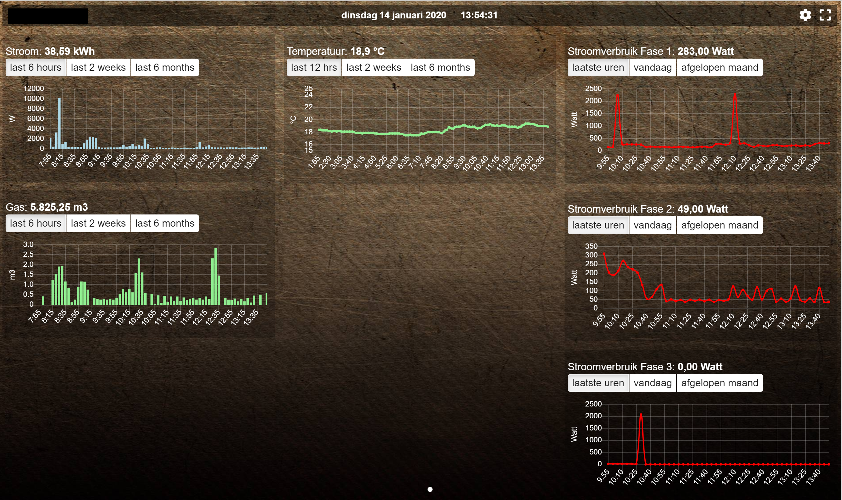
Standard buttons:
Image

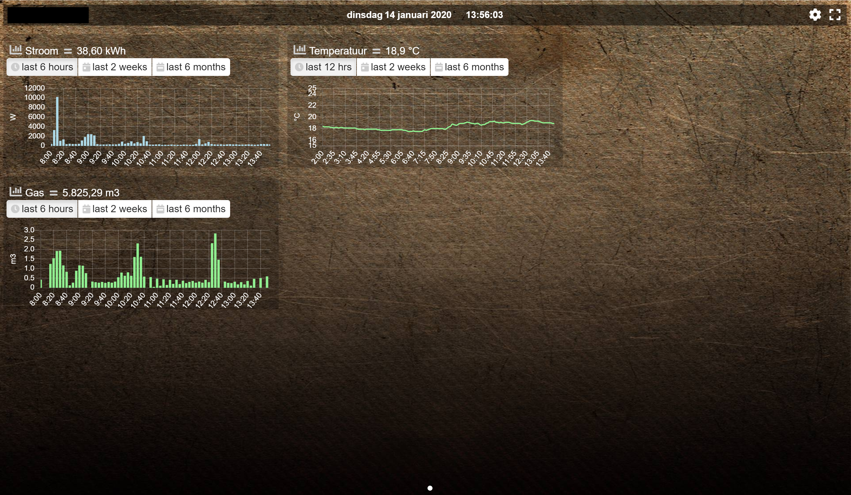
Updated buttons (one of many styles):
Image

Image

Image

Hopefully this allows the user enough customisation for multigraphs. I will try and put together some better guidance with examples.

Cheers ;)

Re: Multiple sources in one graph

Posted: Monday 13 January 2020 22:31
by Lokonli
The multigraph functionality has just been made available on a separate branch named 'multigraph'

After some testing it will be merged into beta.

To switch to this test branch (assuming you have cloned the dashticz repository):

Code: Select all

git fetch
git checkout multigraph
It would be great if some people are willing to test this new functionality.
Documentation will be updated in parallel.

If you have questions or remarks on the multigraph functionality please post them in this thread.

Special thanks to clinkadink for this contribution!

Re: Multiple sources in one graph

Posted: Tuesday 14 January 2020 14:04
by ykuijs
Just took the files from the multigraph branch and copied my config.js from my main folder. When I opened the dashticz dashboard, three of my graphs disappeared.

When I added a multigraph section (just the block, not added the config to a column), the dashboard broke down:
  • my two page dashboard became just one page
  • all my graphs were gone
  • the left column only showed sliders for each of my Hue lights
Basically, all got screwed up :(

I added this block.

Code: Select all

blocks['multigraph_43'] = {
	title: 'Power per phase',
	devices: [ 43, 44,45],
	datasetColors: [colourBlueLight, colourLightGrey, colourBlue],
	graph: 'line',
}
Working page 1:
Image

Working page 2:
Image

Page 2 with new version (three graphs to the right gone)
Image

Page 1 after adding above multigraph section (page 2 gone and a lot of controls jammed onto page 1)
Image

Re: Multiple sources in one graph

Posted: Tuesday 14 January 2020 14:26
by Lokonli
Thanks for testing!

What was the previous Dashticz version you were using? Could you also test with beta 3.3.1?
Then we can differentiate between beta 3.3.1 and multigraph. Multigraph is build on top of 3.3.1, but 3.3.0 and 3.3.1 contain quite some changes as well ...

Re: Multiple sources in one graph

Posted: Tuesday 14 January 2020 15:40
by clinkadink
Do you have the color variables defined? as in colourBlueLight, colourLightGrey, colourBlue?

Code: Select all

datasetColors: [colourBlueLight, colourLightGrey, colourBlue],
I do in my example, but do you have them in yours? For example:

Code: Select all

var colourBlueLight= 'rgba(44, 130, 201, 1)';
If you don't, then this will cause a problem. Please set the dataset colors to html colors, hex code, rgb or rgba string. Example:

Code: Select all

datasetColors: ['red', 'yellow', 'blue', 'orange', 'green', 'purple']
Let me know how you get on.

Thanks.