THIS IS OUTDATED, CHECK THE NEW K-TRON THEME INSTEAD
THE THEME
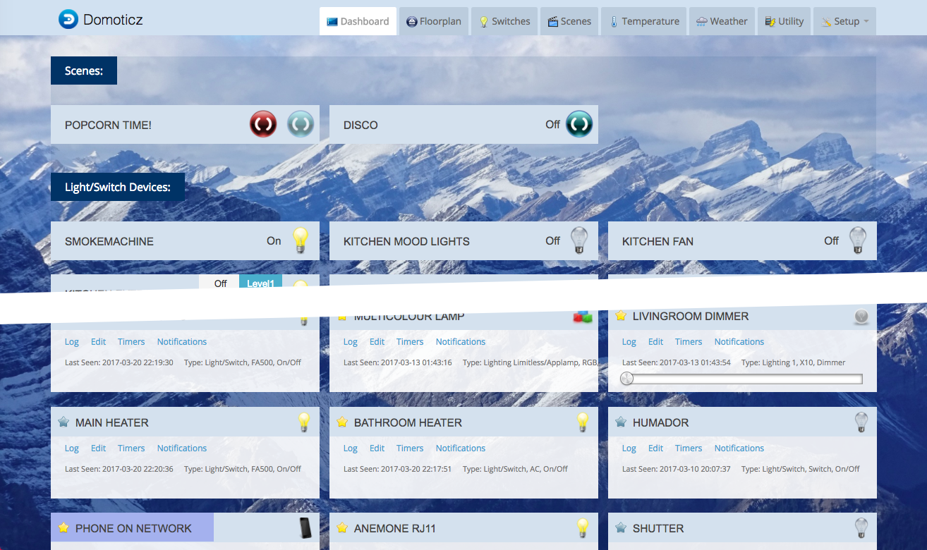
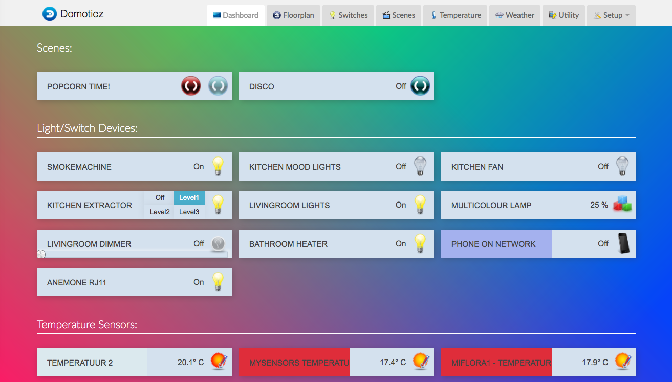
The homepage, keeping it simple:
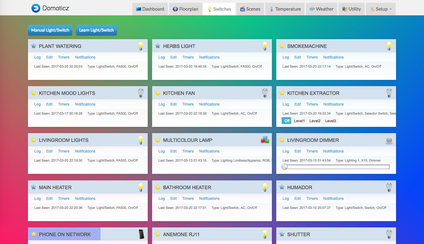
The Switches overview. Moved things around a bit.
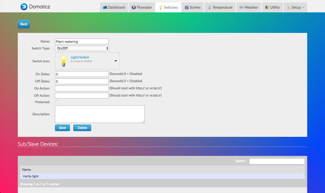
I streamlined all the detail pages too, even moving buttons around through CSS (for now
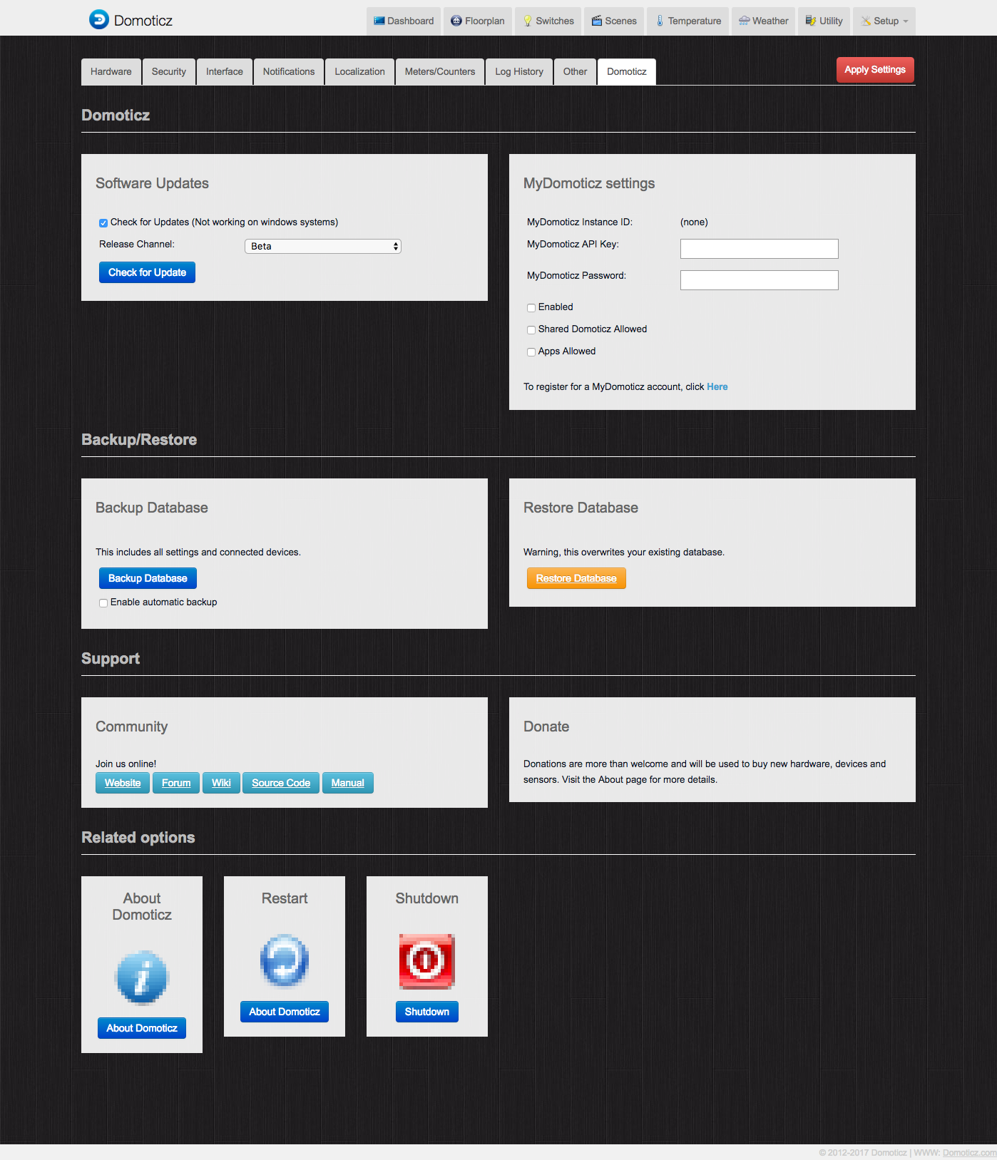
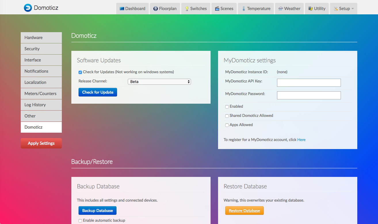
The settings page moves the tabs to a vertical list if your screen is wide enough. And yes, I've totally moved everything around, I'll create a pull-request for the new setup.html file, which I've also cleaned up and standardised. It was quite messy.
As you can see I've also created new shortcuts. The end-goal is to make the complex setup-drowpdown menu a bit less full, where possible.
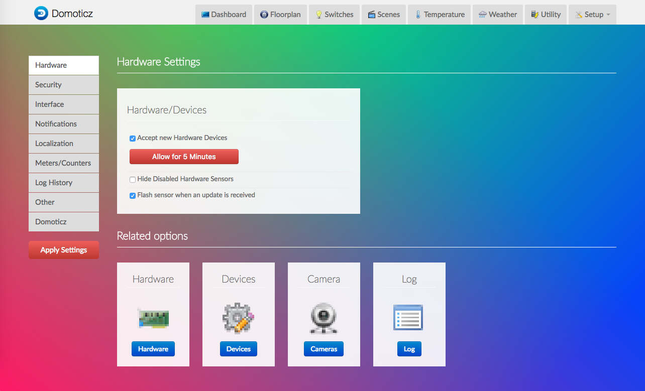
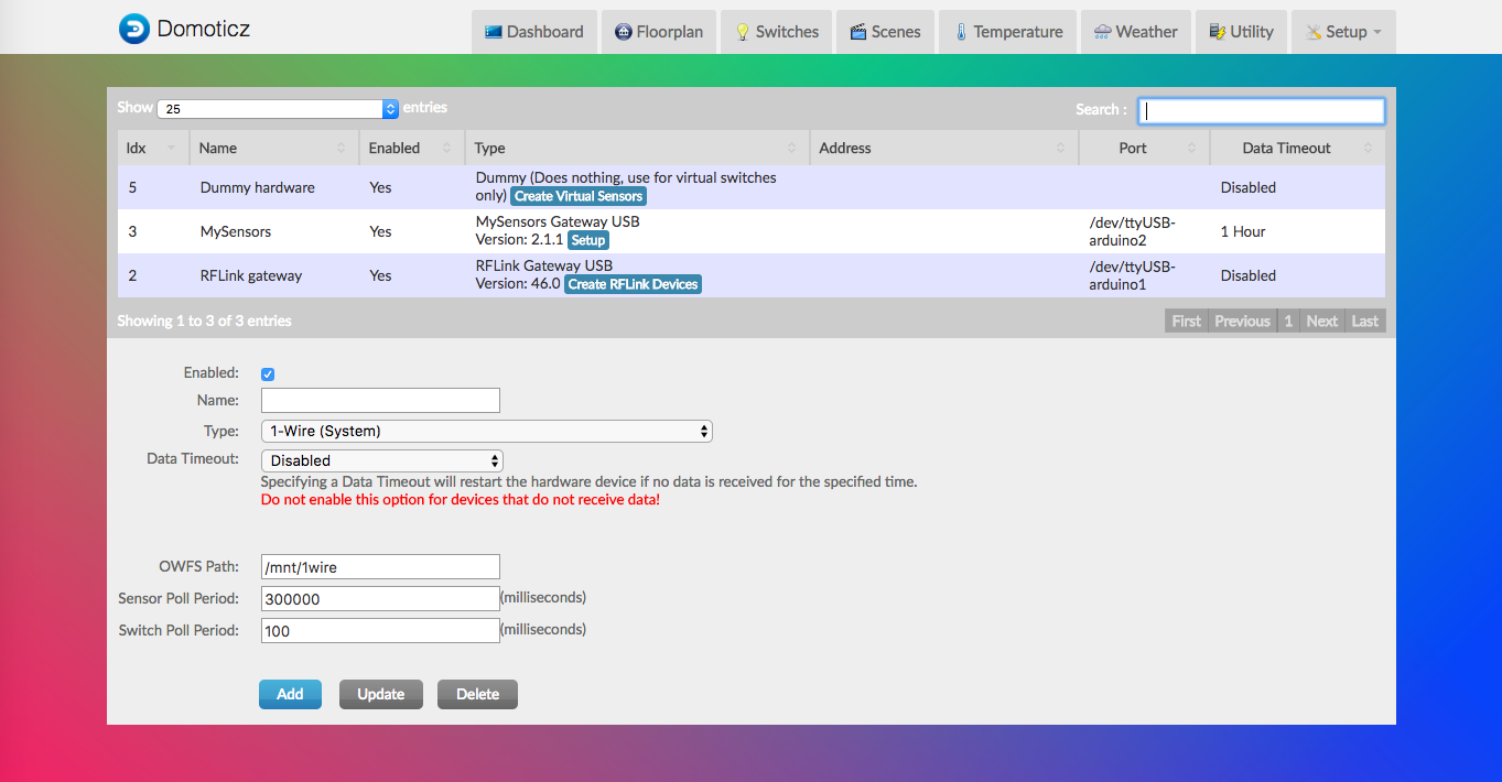
The hardware overview, and all similar pages, have also had some paint.
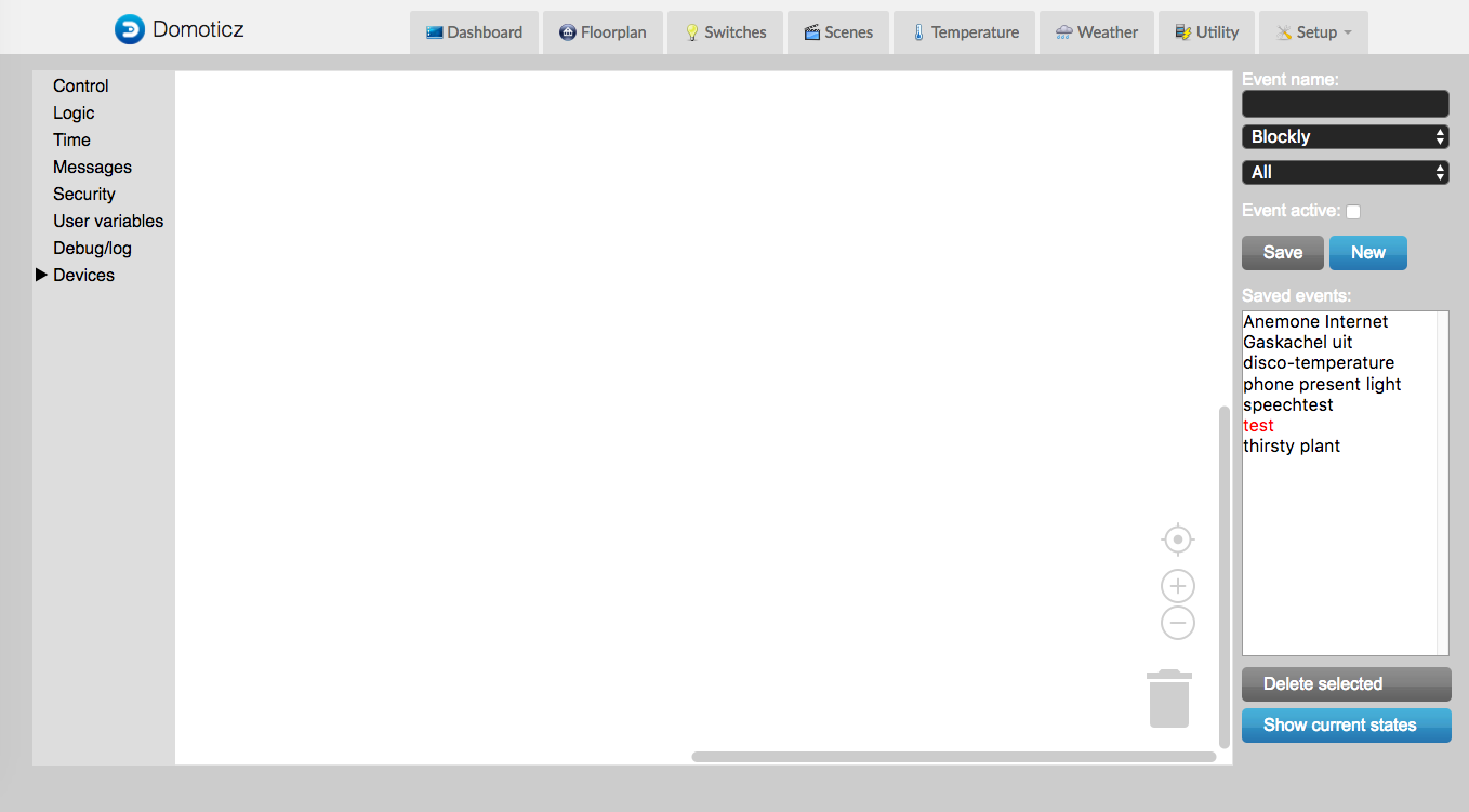
I couldn't style the event-page much, so I tried to just keep it clean and simple, and let the colorful blocks speak.
Almost all you see here is done through CSS. Only a few things few things will need a pull-request, in the form of a cleaned-up setup.html page. I'll create a pull-request for some cleanup/standardisation to the HTML. I've added things like 'related settings' shortcuts.
The additions don't break the old themes. And this new themes uses a sub-CSS page for the most obvious styling. This means that it will become an easy startingpoint for people who also want to theme Domoticz.
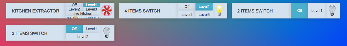
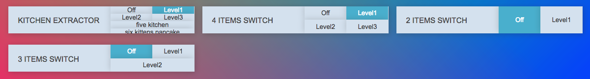
Here's an example of how it changes with a few lines of CSS: