So I redesigned Domoticz from a usability perspective..
Posted: Wednesday 22 February 2017 16:08
As I learnt more about Domoticz, I found that lots of people like me had trouble with the current user experience. As a UX designer I decided to invest some time into thinking about how the experience could be improved.
The goals were:
- Make it more tablet and beginner friendly.
- Bring Domoticz strengths, such as the Blocky implementation, to the surface.
- Keep it relatively easy for the makers of Domoticz to implement. So I tried to work with the current options, and not come up with new ones. It’s a re-shuffling of the interface, or at least that’s the idea here.
You can click through the wireframe here:
https://www.pineapplejazz.com/public/domoticz
In the images the colours mean the following:
- Orange: this shows how the user has currently drilled down in the interface.
- Purple outline: these are buttons you can click on. You can also click on all the main buttons at the top.
DASHBOARD
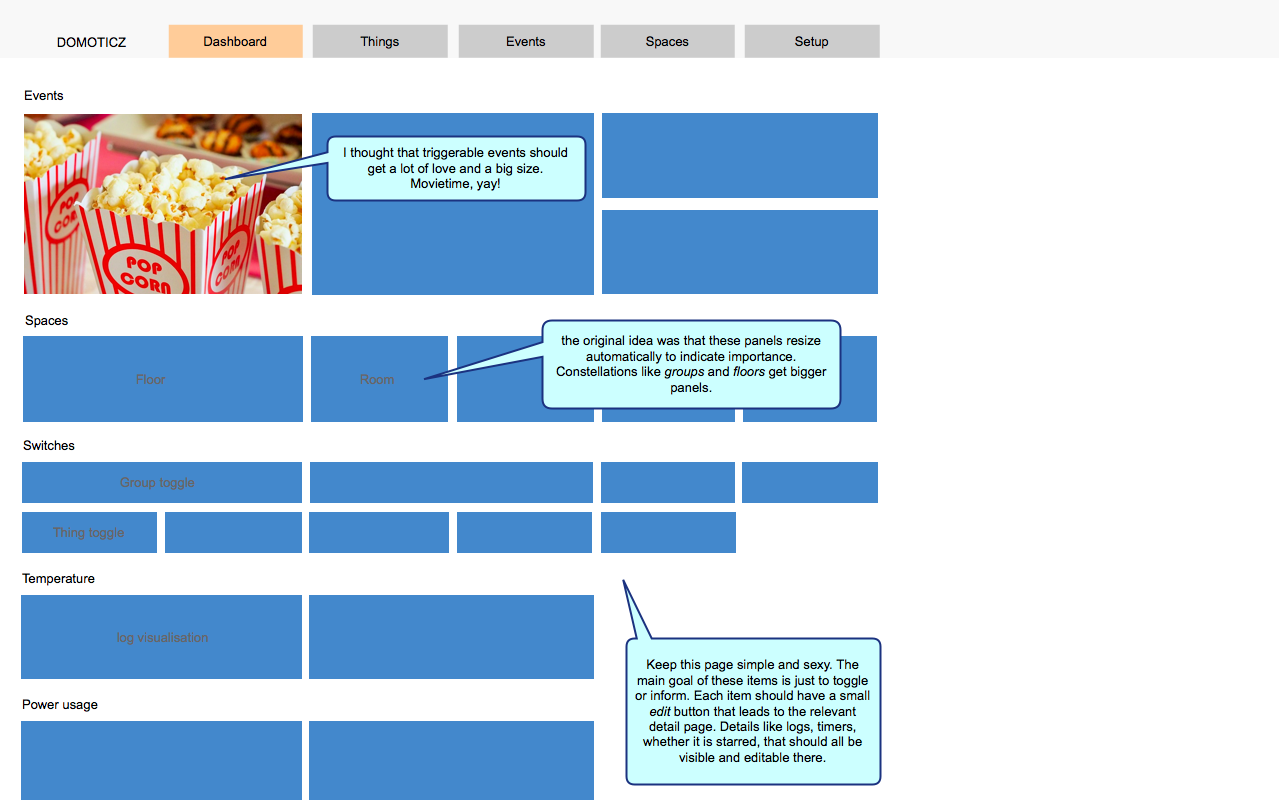
This is similar to the current dashboard. One small difference is that all buttons should have a small button inside of it to quickly dive into settings.It might be an idea to create tabs at the top such as "Overview, Floor 1, Floor 2" if the user has in fact created floors.
THINGS
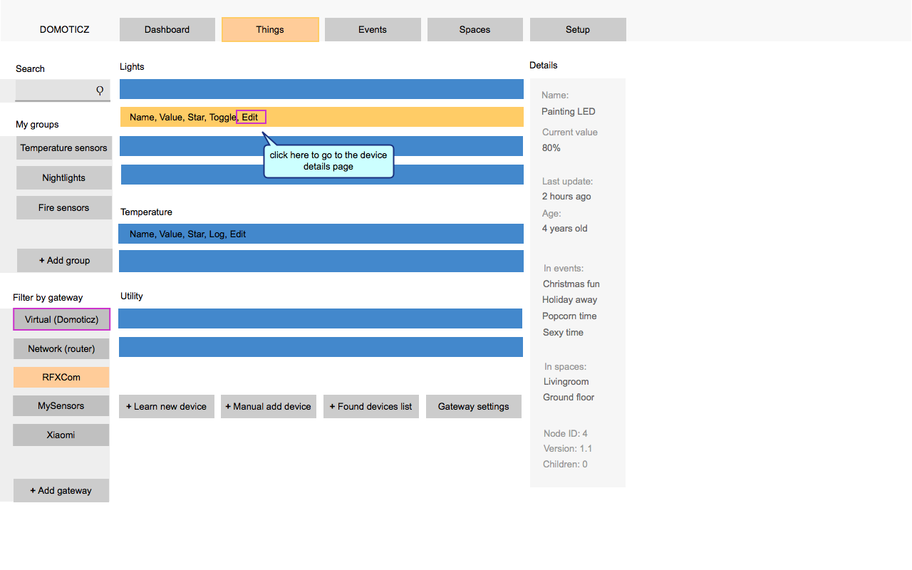
People need a simple mental model of their system. In this design everything connects through a gateway. The users’s ethernet router is also a gateway in this sense, as is the internal USB or bluetooth connection. Domoticz always connects through something, and this allows for a logical grouping of end-nodes:
Virtual switches are also grouped here. This is perhaps radical, but I’ve proposed that data-sources form the internet are shown here too, instead of in the setup menu. The current sun-up and sun-down times could be a 'thing' here (a sensor), as could things like Fibaro or even email (as a virtual actuator of sorts). In the future the webservices could perhaps also be under their own “internet” gateway.
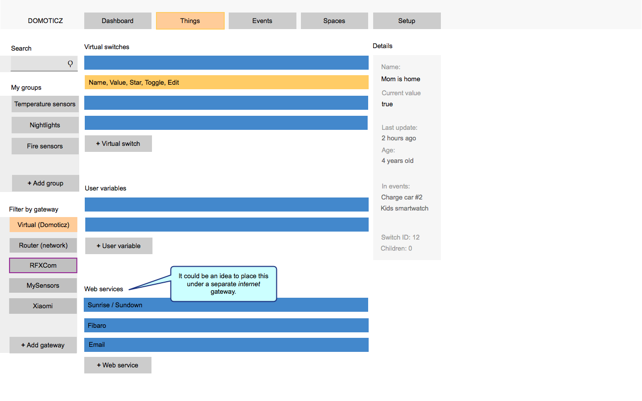
In short you could say that ‘things’ is the place where you manage all the inputs or outputs for the event system:
EVENTS (& SCENES)
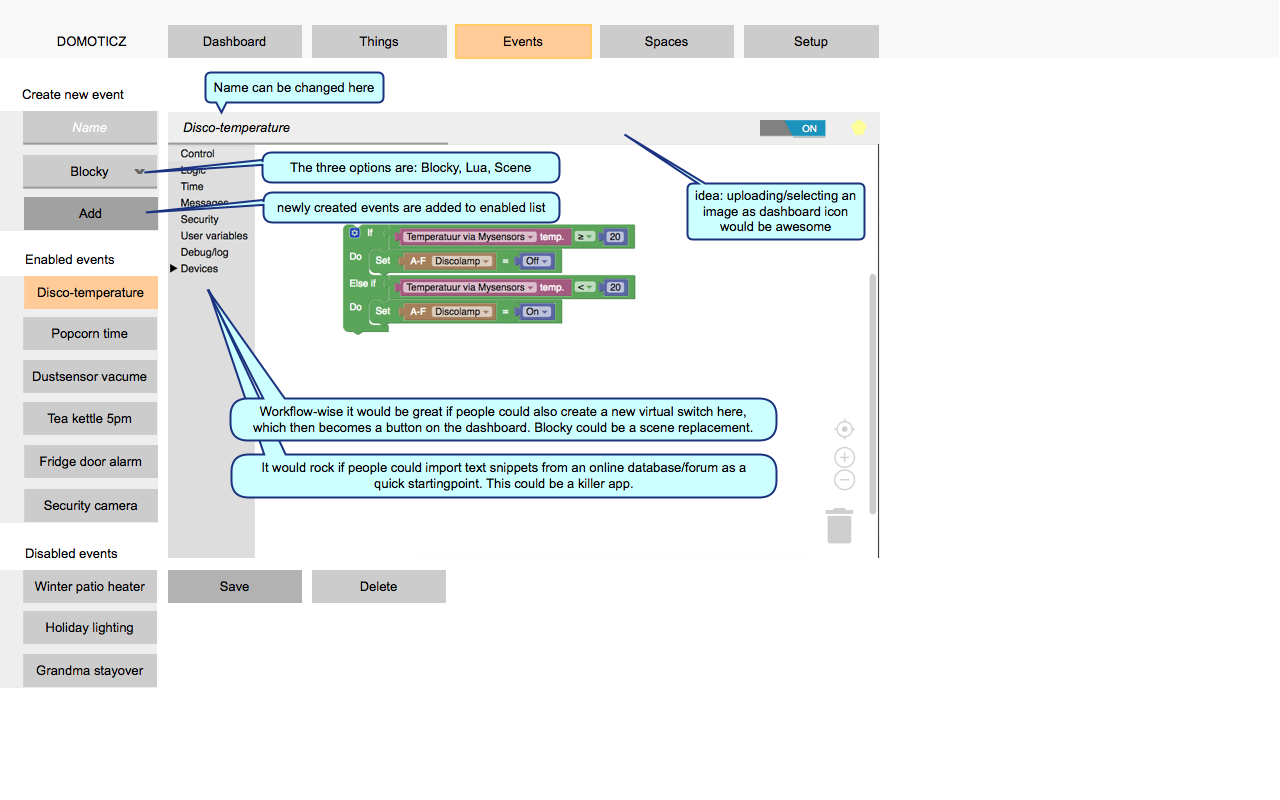
This is the place for all temporal-based logic (in contrast with all spatially oriented constellations under the rooms and groups tab). Scenes can be found here, but my main focus was to give more love to the Blocky builder, which I think it a real unique selling point and killer app of Domoticz. For me, it’s why I stuck with it. I didn’t understand why it was so hidden.
In the list on the left side I have made no distinction between Blocky, Lua or Scene events, but they could easily be unmixed and ordered by type. I also played with the idea of tabs at the top to separate all three types of logic, but thought the simplicity shown here would be ok for most domestic use cases. Ordering them by tab could perhaps be a power-user option.
SPACES
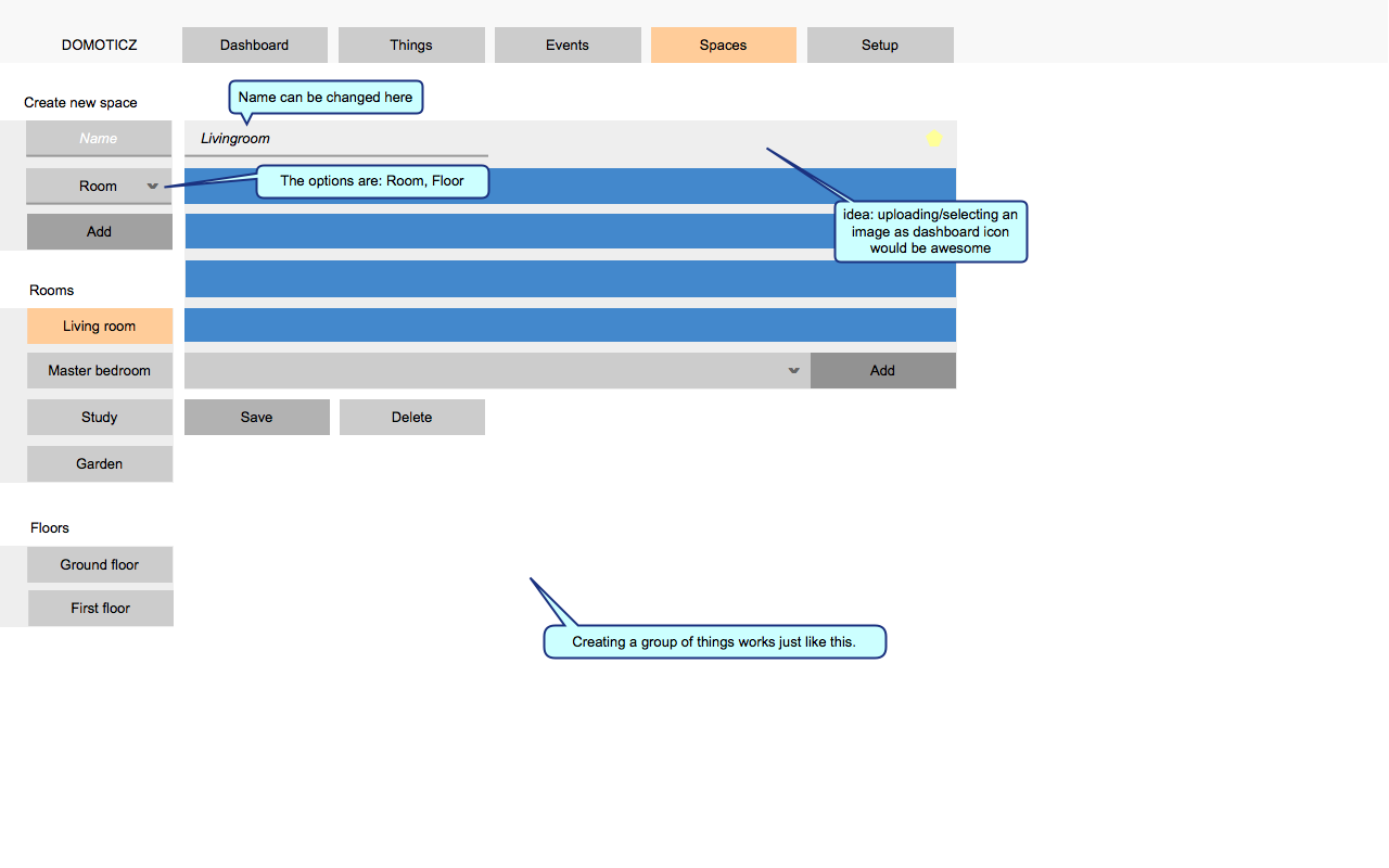
Where you could say that 'events' is about temporal logic, this is about steady spatial organization of things. Floors are just a special type of room that also has a map. I must admit I don't use this feature personally.
SETUP
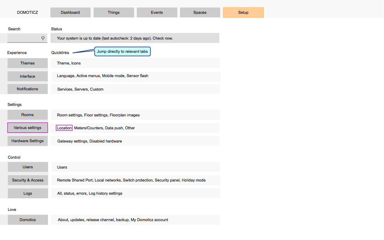
Here I spent some time rethinking where I would put things, and how they could be categorized. It's not perfect, but it's a start. I also think a built-in help function would be useful. The overview page would offer quick links to the various pages.
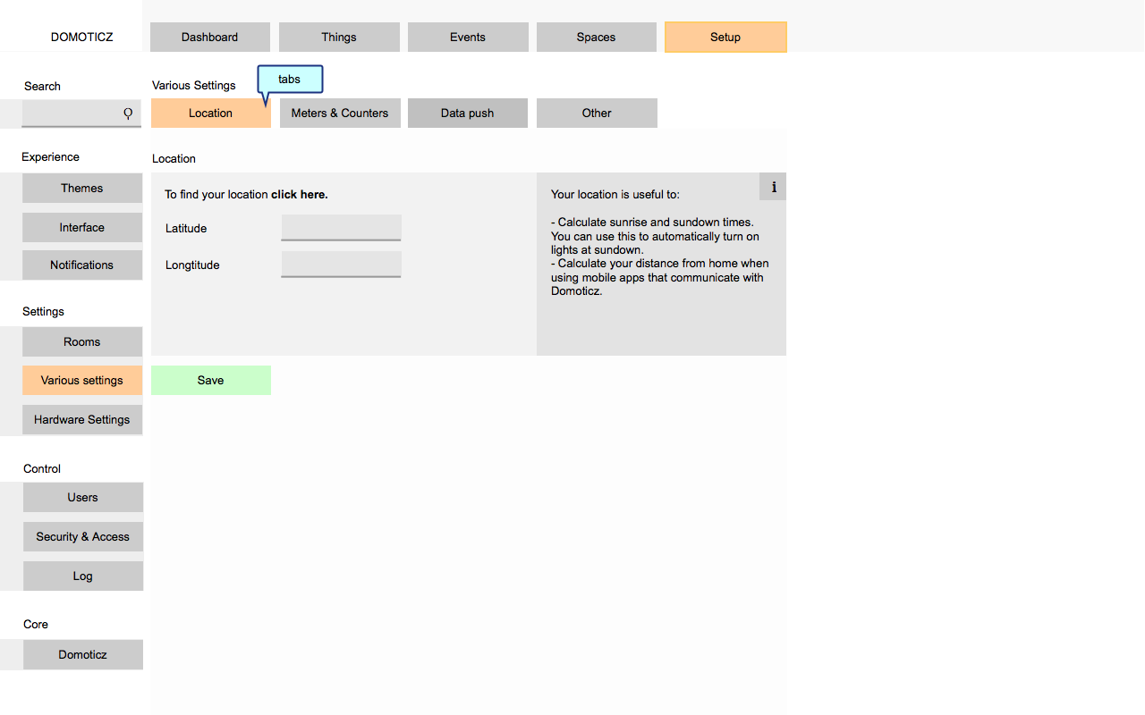
Here you can see the idea of putting 'help' a bit more center stage:
//ADDITION: THING PAGE
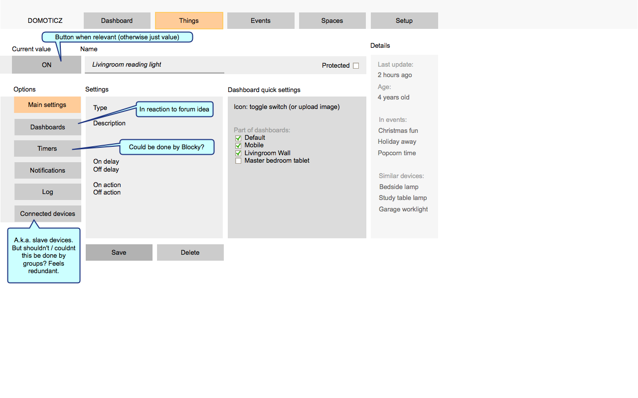
In response to the conversation below I created a detail page for a thing. It hints at the idea that it would be useful to have multiple dashboards.It also made me realize that 'timers' could be the 4th event-type under events. It would be my adviceto explore if Blocky could be used to also replace the timers functionality. Keep all intelligence in one place.
INTERFACE COMPLEXITY
- A lot of the geeky details are pushed back a little (version or node-ID doesn’t need to be so prominent all the time)
- Sometimes users might understandable look for things in multiple places. For example, selecting if you want temperature in celsius or fahrenheit might be placed under interface,various settings or even connected to geolocation if we stretch that to mean 'localization'. Whatever the choice, just link to that settings page from the other logical places.
- It would rock if the interface could become more complex in parts that certain power users need, toggled by a setting somewhere under the SETUP area. For example, the simple list of events could get too long. Then a user could turn on “allow grouping of events”, and only then would they get the option of create categories to which they could add/sort the events. Or sort them by type, as mentioned earlier. It would be interesting if the user could decide the names of these groups (currently in blocky there are pre-defined “Device, security, time, user variable” categories).
MENU THOUGHTS
- The menu is arranged from used a lot on the left (dashboard) to used least (setup) on the right. 'Things' is the second menu option because the current design could be useful enough to quickly get to less-often used devices that are not placed on the dashboard. But it could be moved.
- The Domoticz logo could be the dashboard button, removing one button at the top.
- The whole ‘spaces’ menu option should be optional, like it is now.
OTHER
- Camera’s are no longer a special case. They are just things like any other. If there is a reason they were separated, do tell.
FUTURE DIRECTIONS
- If reaching a wider audience is the goal, I think the Blocky interface could be put more center-stage. It could become the center for creating scenes instead of the current separate scenes system. The Domoticz systems is currently more powerful than even commercial systems like Homey:
https://www.youtube.com/watch?v=pztkJfZO2u0
Curious about your reactions.
This wireframe was made with Pencil, which is open source software. The source file can be found here:
http://www.pineapplejazz.com/public/dom ... moticz6.ep
The goals were:
- Make it more tablet and beginner friendly.
- Bring Domoticz strengths, such as the Blocky implementation, to the surface.
- Keep it relatively easy for the makers of Domoticz to implement. So I tried to work with the current options, and not come up with new ones. It’s a re-shuffling of the interface, or at least that’s the idea here.
You can click through the wireframe here:
https://www.pineapplejazz.com/public/domoticz
In the images the colours mean the following:
- Orange: this shows how the user has currently drilled down in the interface.
- Purple outline: these are buttons you can click on. You can also click on all the main buttons at the top.
DASHBOARD
This is similar to the current dashboard. One small difference is that all buttons should have a small button inside of it to quickly dive into settings.It might be an idea to create tabs at the top such as "Overview, Floor 1, Floor 2" if the user has in fact created floors.

THINGS
People need a simple mental model of their system. In this design everything connects through a gateway. The users’s ethernet router is also a gateway in this sense, as is the internal USB or bluetooth connection. Domoticz always connects through something, and this allows for a logical grouping of end-nodes:

Virtual switches are also grouped here. This is perhaps radical, but I’ve proposed that data-sources form the internet are shown here too, instead of in the setup menu. The current sun-up and sun-down times could be a 'thing' here (a sensor), as could things like Fibaro or even email (as a virtual actuator of sorts). In the future the webservices could perhaps also be under their own “internet” gateway.

In short you could say that ‘things’ is the place where you manage all the inputs or outputs for the event system:
EVENTS (& SCENES)
This is the place for all temporal-based logic (in contrast with all spatially oriented constellations under the rooms and groups tab). Scenes can be found here, but my main focus was to give more love to the Blocky builder, which I think it a real unique selling point and killer app of Domoticz. For me, it’s why I stuck with it. I didn’t understand why it was so hidden.
In the list on the left side I have made no distinction between Blocky, Lua or Scene events, but they could easily be unmixed and ordered by type. I also played with the idea of tabs at the top to separate all three types of logic, but thought the simplicity shown here would be ok for most domestic use cases. Ordering them by tab could perhaps be a power-user option.

SPACES
Where you could say that 'events' is about temporal logic, this is about steady spatial organization of things. Floors are just a special type of room that also has a map. I must admit I don't use this feature personally.

SETUP
Here I spent some time rethinking where I would put things, and how they could be categorized. It's not perfect, but it's a start. I also think a built-in help function would be useful. The overview page would offer quick links to the various pages.

Here you can see the idea of putting 'help' a bit more center stage:

//ADDITION: THING PAGE
In response to the conversation below I created a detail page for a thing. It hints at the idea that it would be useful to have multiple dashboards.It also made me realize that 'timers' could be the 4th event-type under events. It would be my adviceto explore if Blocky could be used to also replace the timers functionality. Keep all intelligence in one place.

INTERFACE COMPLEXITY
- A lot of the geeky details are pushed back a little (version or node-ID doesn’t need to be so prominent all the time)
- Sometimes users might understandable look for things in multiple places. For example, selecting if you want temperature in celsius or fahrenheit might be placed under interface,various settings or even connected to geolocation if we stretch that to mean 'localization'. Whatever the choice, just link to that settings page from the other logical places.
- It would rock if the interface could become more complex in parts that certain power users need, toggled by a setting somewhere under the SETUP area. For example, the simple list of events could get too long. Then a user could turn on “allow grouping of events”, and only then would they get the option of create categories to which they could add/sort the events. Or sort them by type, as mentioned earlier. It would be interesting if the user could decide the names of these groups (currently in blocky there are pre-defined “Device, security, time, user variable” categories).
MENU THOUGHTS
- The menu is arranged from used a lot on the left (dashboard) to used least (setup) on the right. 'Things' is the second menu option because the current design could be useful enough to quickly get to less-often used devices that are not placed on the dashboard. But it could be moved.
- The Domoticz logo could be the dashboard button, removing one button at the top.
- The whole ‘spaces’ menu option should be optional, like it is now.
OTHER
- Camera’s are no longer a special case. They are just things like any other. If there is a reason they were separated, do tell.
FUTURE DIRECTIONS
- If reaching a wider audience is the goal, I think the Blocky interface could be put more center-stage. It could become the center for creating scenes instead of the current separate scenes system. The Domoticz systems is currently more powerful than even commercial systems like Homey:
https://www.youtube.com/watch?v=pztkJfZO2u0
Curious about your reactions.
This wireframe was made with Pencil, which is open source software. The source file can be found here:
http://www.pineapplejazz.com/public/dom ... moticz6.ep