Page 18 of 24
Re: Aurora theme
Posted: Tuesday 15 May 2018 12:01
by quack3d
@blauwebuis That's only for the text and background color, no? For instance the switches are in a third color (blueish gray) and the top menu bar (I don't like the side bar) is in a fourth (light gray) color.
Re: Aurora theme
Posted: Tuesday 15 May 2018 15:41
by quirk
Thanks for this great theme, I just noticed a small error regarding the rendering of switch as picklist (only in the dashboard)

Re: Aurora theme
Posted: Thursday 17 May 2018 11:48
by Xztraz
Jochem wrote: Wednesday 09 May 2018 21:06
Hello Xtraz,
That' s the problem that I have, but I don't understand how to fix it...
That bug should be fixed now. its not a aurora bug. rather a domoticz framework thingie. see if it works now
Re: Aurora theme
Posted: Friday 18 May 2018 20:23
by rednas
I am having some problems with the theme. I really like the theme!
#1: The layout of the clock is different than the other items. I am also not able to drag it, is this right?

#2: Some items have shadows and others don't. In the darker theme it isn't really visible, but with the lighter colours you see it clearly. I guess the box-shadows need to be removed from the css. There is a box shadow as well underneath the text of a text device. This might be removed as well.

#3: My text devices aren't grouped if I give them a similar name like "Text - 1", "Text - 2" and "Text - 3". Is this right?
#4: Is the version number of the theme shown somewhere? Otherwise I would like to see this added as well for updating the theme.
Thanks in advance!
Re: Aurora theme
Posted: Thursday 24 May 2018 7:51
by Nomader
great work.. this has actually given domoticz a fresh breath!!!
one request though.. can you give us the ability to choose color for the sliders as well.. the bluish is just to fade and does not differentiate much from the white when it is all the way left.
thanks!!!!
aa and one small bug..
the slider on the iphone style are not working correctly.. the are further right than the should be... it is obvious on mobile phones
Re: Aurora theme
Posted: Friday 25 May 2018 9:20
by quack3d
When having the menu at the top the option to choose rooms is hidden.

- Aurora.png (7.62 KiB) Viewed 3483 times
Re: Aurora theme
Posted: Sunday 27 May 2018 19:30
by Xztraz
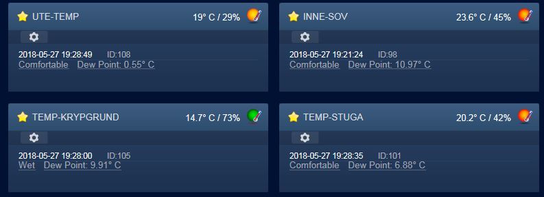
Hm. temperature log and notifications buttons missing

- qwqweqeqe.JPG (38.54 KiB) Viewed 3414 times
Re: Aurora theme
Posted: Monday 28 May 2018 14:04
by blauwebuis
@quack3D: ah yes, that color cannot be changed via the interface. But you can add your own CSS to do that. I was hoping people would share CSS for such small things.
@rednas:
- Yes, the clock is different. You cannot move it.
- The block shadow is replaced by a red line in your case. It cannot show both the shadow and the line.
- Grouping should work. Try using letters (a b c) instead of a number.
- The theme does not use a versioning system. You are expected to always update to the latest version, as there is no risk involved in updating. It's all just styling.
I have fixed the missing buttons on the temperature page.
Re: Aurora theme
Posted: Monday 28 May 2018 14:13
by blauwebuis
@quack3D: could you try adding this custom CSS:
body:not(.login) #holder .container-fluid {padding-top:50px}
Re: Aurora theme
Posted: Monday 28 May 2018 14:26
by quack3d
blauwebuis wrote: Monday 28 May 2018 14:04
@quack3D: ah yes, that color cannot be changed via the interface. But you can add your own CSS to do that. I was hoping people would share CSS for such small things.
Yeah, exactly. I was hoping someone would share a nice complete CSS that "worked together" with all other colors.

blauwebuis wrote: Monday 28 May 2018 14:13
@quack3D: could you try adding this custom CSS:
body:not(.login) #holder .container-fluid {padding-top:50px}
It works but it also pushes the Manual Light/Switch and Learn Light/Switch in Switches down below it. Same on the Temperature tab. I would say the Room selector should be at the same height as those buttons, not above them.
Re: Aurora theme
Posted: Monday 28 May 2018 14:46
by rednas
blauwebuis wrote: Monday 28 May 2018 14:04
- Grouping should work. Try using letters (a b c) instead of a number.
Using letters doesn't work as well.. Mine are called "Containers - A", "Containers - B" .. "Containers - D".
Re: Aurora theme
Posted: Monday 28 May 2018 15:30
by blauwebuis
@rednas: You can only merge simple items. Or try adding one switch to the mix.
I've added a fix for the dropdown.
Re: Aurora theme
Posted: Monday 28 May 2018 16:24
by rednas
blauwebuis wrote: Monday 28 May 2018 15:30
@rednas: You can only merge simple items. Or try adding one switch to the mix.
What do you mean exactly with simple items? Adding a switch to the mix doesn't work, as it places the switch at a different column.
Re: Aurora theme
Posted: Monday 28 May 2018 22:58
by Xztraz
@rednas: You can only merge simple items. Or try adding one switch to the mix.
[/quote]
What do you mean exactly with simple items? Adding a switch to the mix doesn't work, as it places the switch at a different column.
[/quote]
only items with one icon works in groups for example
@blauwebuis
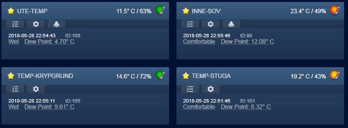
Almost there. temp log seem ok now

Notifications still need a touch. Seem like items with a notification already set don't show the icon (colored version).

- dddaaaas.JPG (33.59 KiB) Viewed 3320 times
Re: Aurora theme
Posted: Monday 28 May 2018 23:28
by devros
hello, found and fixed bug... (hope that fix is safe for rest theme

)

Code: Select all
.btn-small.btn-default {
	padding: 0;
}
also
Code: Select all
body:not(.login) #holder .container-fluid {padding-top:50px}
should be in git by default...
Re: Aurora theme
Posted: Tuesday 29 May 2018 14:22
by blauwebuis
@devros: I've added the horizontal menu fix.
I'm not sure how the other CSS lead to the fix of the buttons ow fitting in the item. The item seams wider, while the fix implies that the buttons become narrower.
I've also added a fix for the missing option buttons.
Re: Aurora theme
Posted: Tuesday 29 May 2018 14:37
by devros
blauwebuis wrote: Tuesday 29 May 2018 14:22
@devros: I've added the horizontal menu fix.
I'm not sure how the other CSS lead to the fix of the buttons ow fitting in the item. The item seams wider, while the fix implies that the buttons become narrower.
I've also added a fix for the missing option buttons.
Thank
one bug remain ... still have problem on iphone with first column on dashboard (its little wider than the box)
Tried to find whats wrong but its something deep in css code:) (propably something in selector switch code)
attached screenshot

any plan for future versions

?
Re: Aurora theme
Posted: Tuesday 29 May 2018 15:19
by devros
blauwebuis wrote: Tuesday 29 May 2018 14:22
@devros: I've added the horizontal menu fix.
I'm not sure how the other CSS lead to the fix of the buttons ow fitting in the item. The item seams wider, while the fix implies that the buttons become narrower.
Maybe i did wrong screenshot, size of panel is same...
I tried few setting and buttons works without problem with this setting and fluid resizing...
Domoticz css is so complicated... some simplify css code in future would be nice-

Re: Aurora theme
Posted: Wednesday 30 May 2018 13:30
by Xztraz
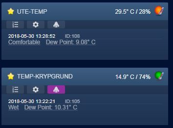
Now i can see all buttons on temp page.
Great work!

- qwqweqeqw.JPG (21.08 KiB) Viewed 3189 times
Re: Aurora theme
Posted: Wednesday 30 May 2018 21:30
by rednas
I finally got the grouping to work. But, there is some kind of bug in there:

Can I fix this myself or what is going wrong?


