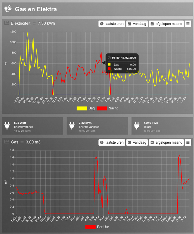
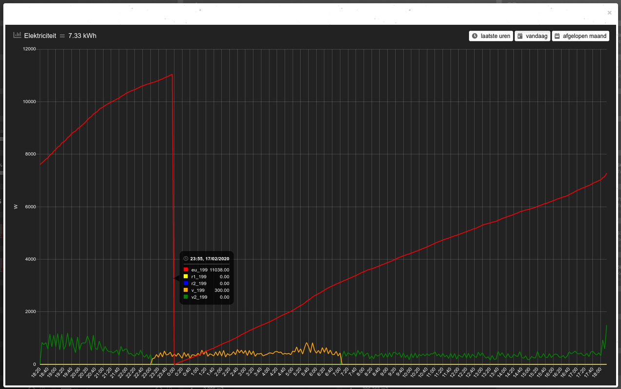
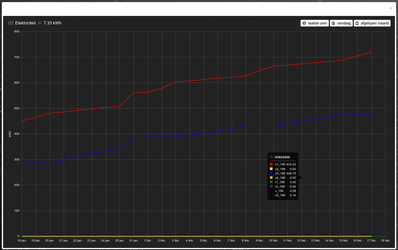
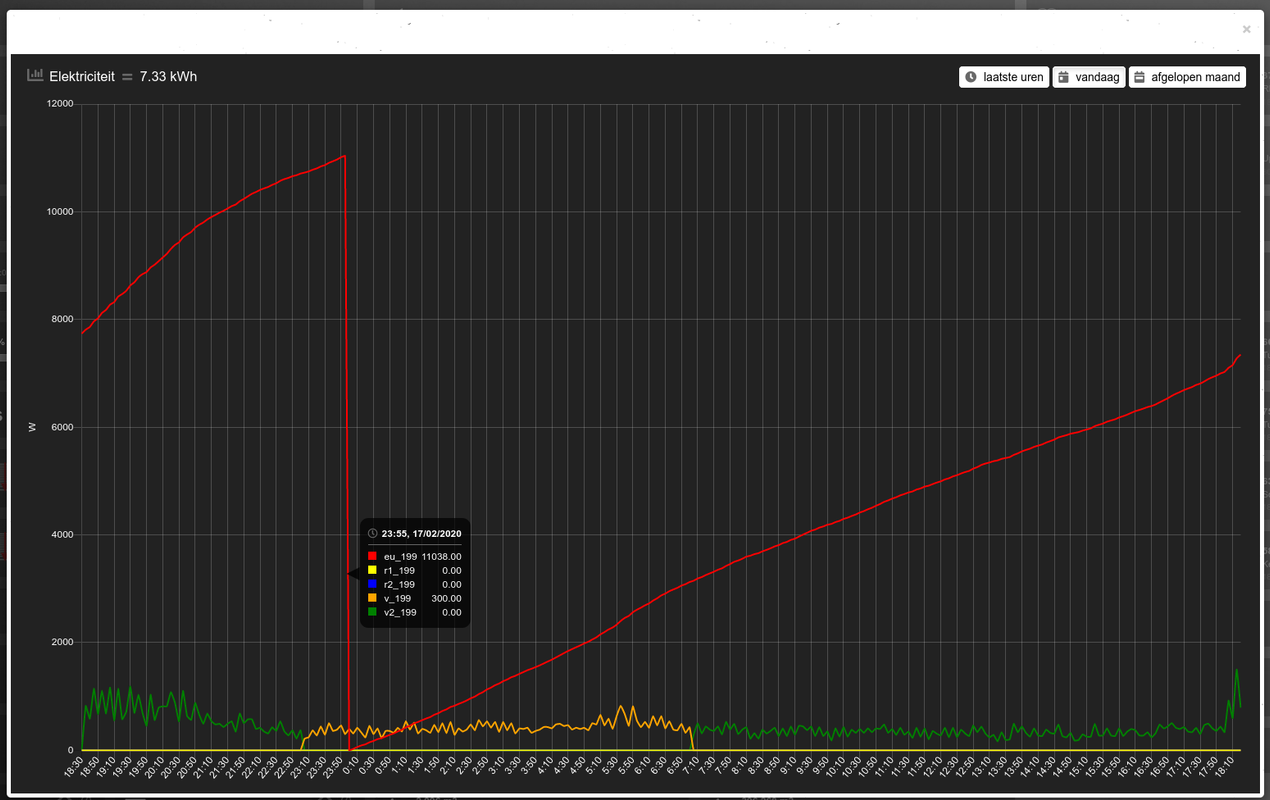
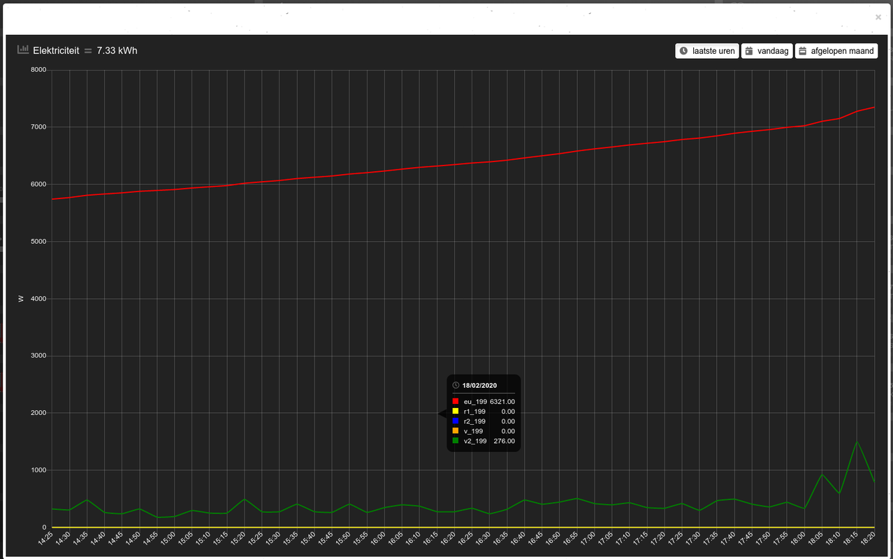
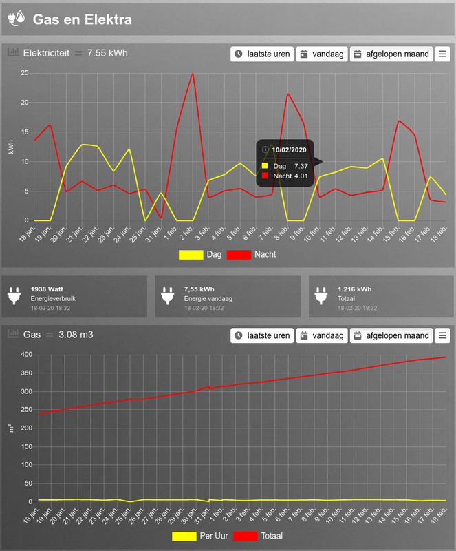
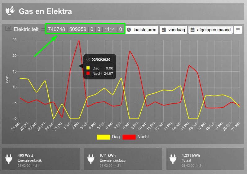
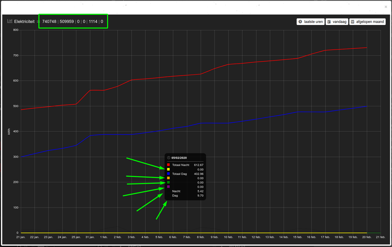
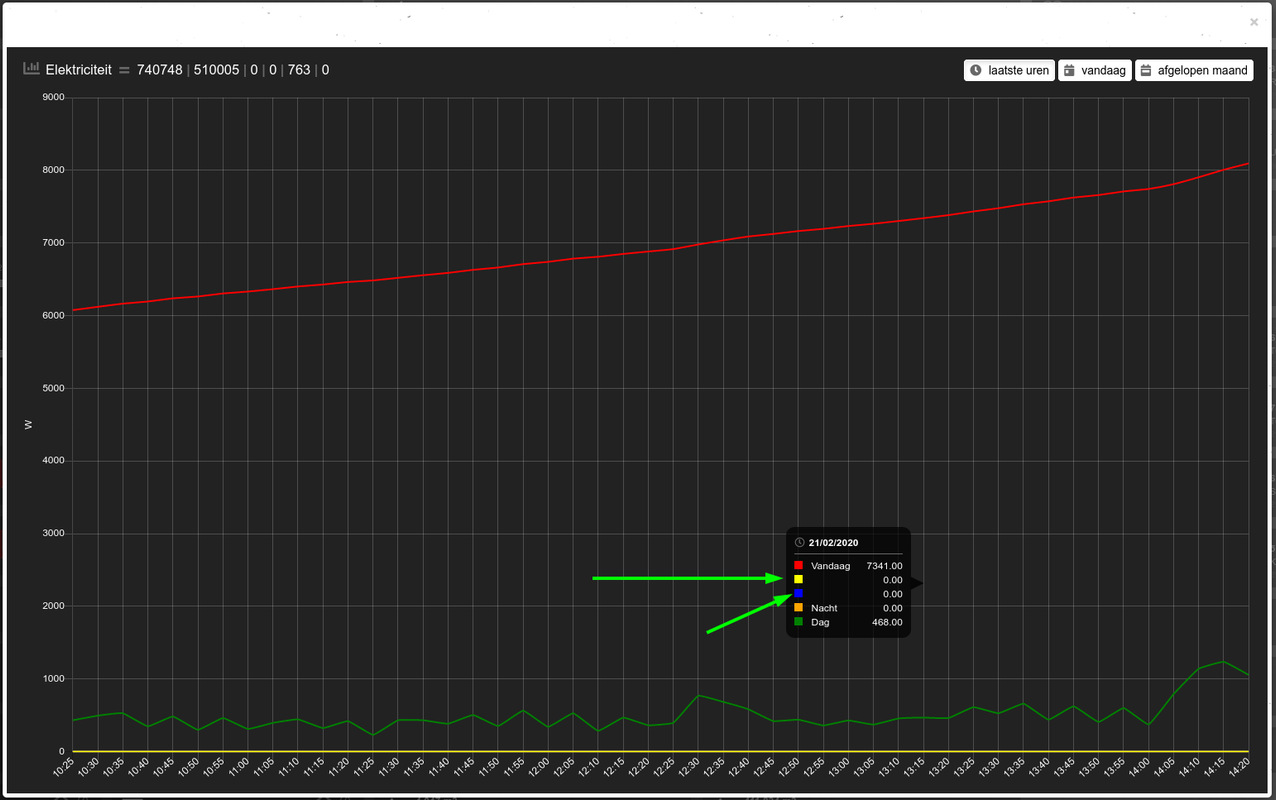
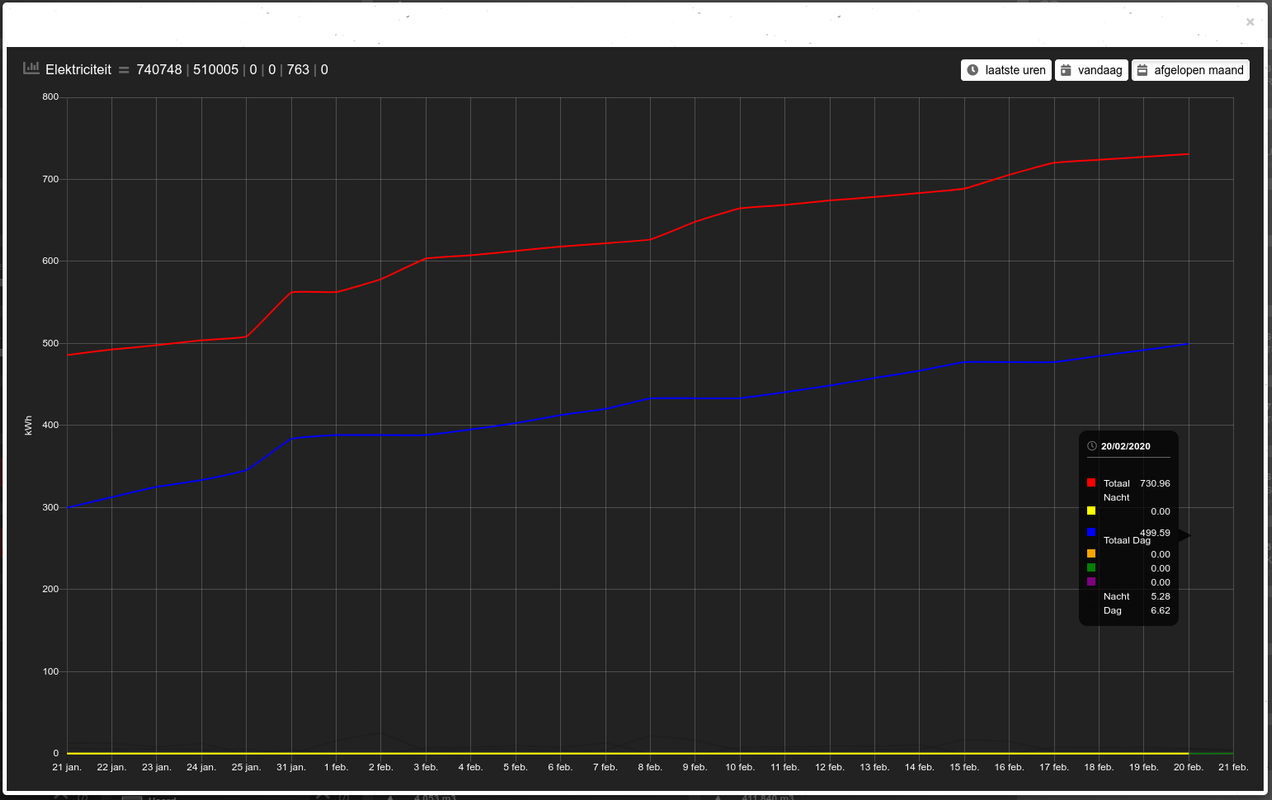
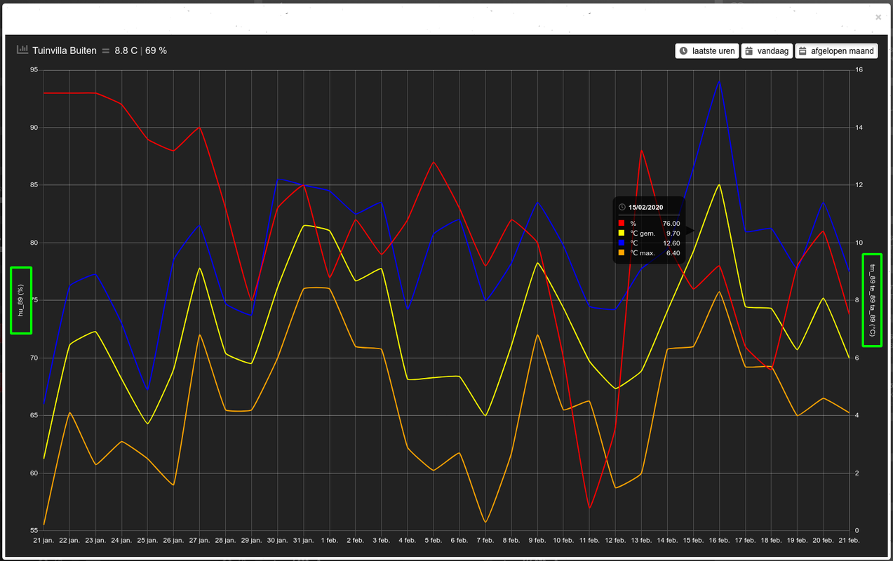
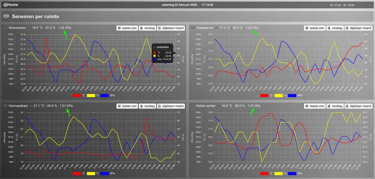
Although adding a multi graph to my dashboard was there ever since the functionality was introduced, I only found time today to dig into it. The results are awesome, especially with the 'zoom' allowed!
To find some nice color schemes for graphs, you can visit this website:
http://colorbrewer2.org/#type=diverging&scheme=RdGy&n=6
There you can select the amount of colors, color scheme etc etc. With the 'export' option in the middle of the screen, you can pick RGB and rightaway have your dataColorSet at hand! Might be an interesting link for the wiki.
some samples I tried and are stored in my config.js:
//datasetColors: ['red', 'blue', 'yellow', 'orange', 'green', 'purple']
//color scheme taken from
http://colorbrewer2.org/#type=diverging&scheme=RdGy&n=6
//datasetColors: ['rgb(178,24,43)','rgb(239,138,98)','rgb(253,219,199)','rgb(224,224,224)','rgb(153,153,153)','rgb(77,77,77)']
datasetColors: ['rgb(102,194,165)','rgb(252,141,98)','rgb(141,160,203)','rgb(231,138,195)','rgb(166,216,84)','rgb(255,217,47)']

