Page 1 of 1
Dashticz - Themes
Posted: Tuesday 16 January 2018 10:07
by DewGew
In latest beta is
Themes in settings. You can now create your own themes.
Create a new folder in themes folder eg. 'mytheme' then create 'mytheme.css'. The css file and folder must have the same name. (eg. mytheme/mytheme.css). Edit your mytheme.css for your needs.
Note: Theme.css will be override by custom.css
How to use:
Add your theme name in screen tab in settings or add to your CONFIG.js:
Re: Dashticz - Themes
Posted: Tuesday 16 January 2018 18:28
by EdwinK
Cool, I think. Hope we will see loads of nice themes

Re: Dashticz - Themes
Posted: Wednesday 17 January 2018 13:24
by DewGew
Here is an example of a theme:
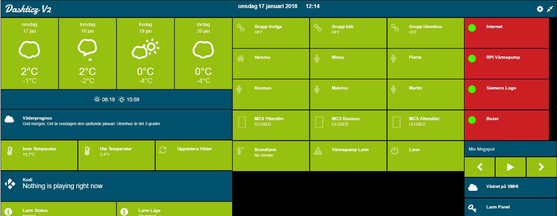
- theme.jpg (90.78 KiB) Viewed 3829 times
When hover over a switch, the switch scales up:
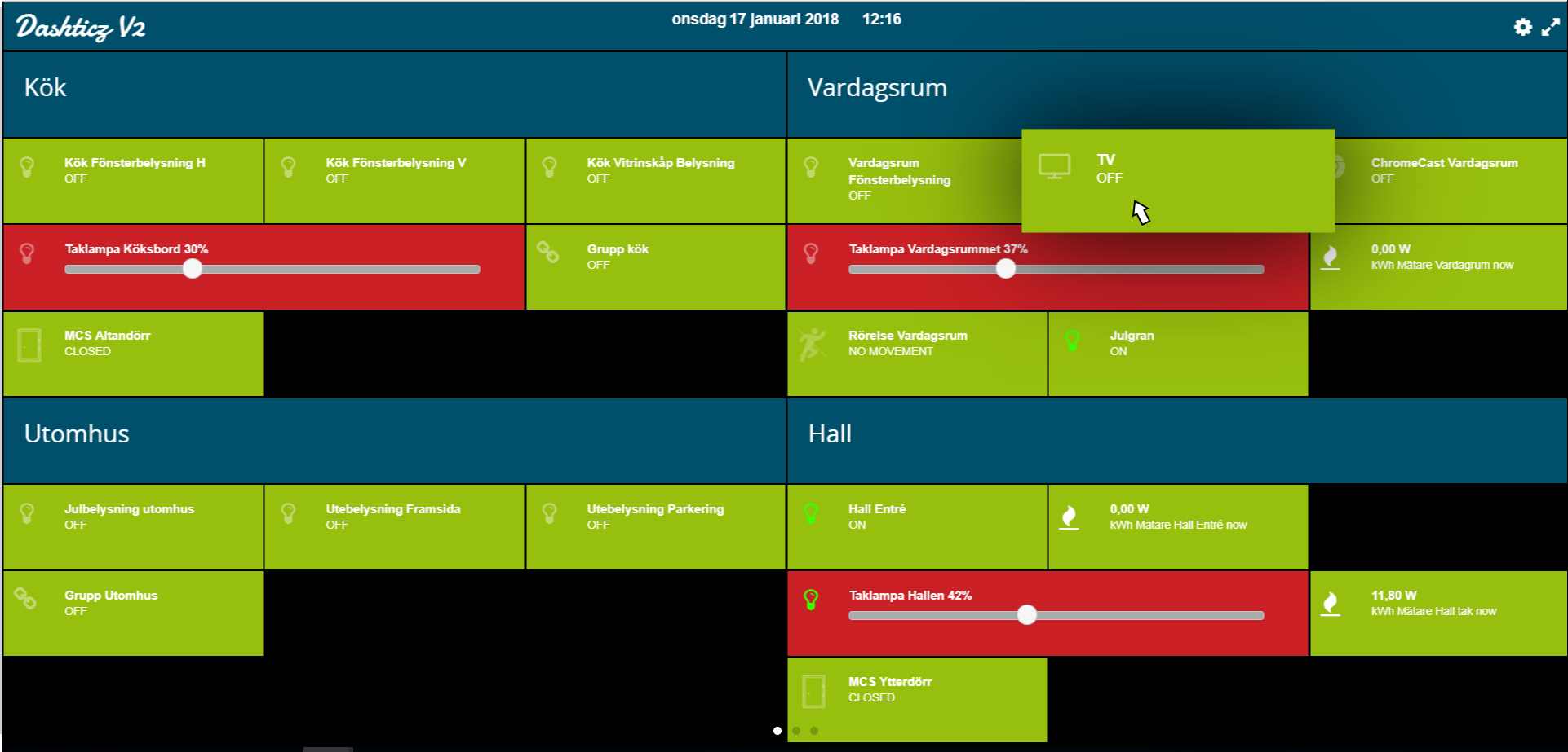
- theme_hover.jpg (93.74 KiB) Viewed 3829 times
theme.css:
Code: Select all
/* CSS Document */
@import url(https://fonts.googleapis.com/css?family=Damion);

.fa,.wi {
   font-size:24px !important;
}
.transbg.col-xs-1,
.transbg.col-xs-2,
.transbg.col-xs-3,
.transbg.col-xs-4,
.transbg.col-xs-5,
.transbg.col-xs-6 {
	padding-top:15px;
	padding-bottom:15px;
	border: 1px solid rgba(24,24,24,0) !important;
    background: #97bf0d;
    background-clip: padding-box;
}
.transbg.col-xs-7,
.transbg.col-xs-8,
.transbg.col-xs-9,
.transbg.col-xs-10,
.transbg.col-xs-11 {
	padding-top:15px;
	padding-bottom:15px;
	border: 1px solid rgba(24,24,24,0) !important;
    background: #cb2025;
    background-clip: padding-box;
}
.transbg.col-xs-12,
.transbg.dark.col-xs-1,
.transbg.dark.col-xs-2,
.transbg.dark.col-xs-3,
.transbg.dark.col-xs-4,
.transbg.dark.col-xs-5,
.transbg.dark.col-xs-6,
.transbg.dark.col-xs-7,
.transbg.dark.col-xs-8,
.transbg.dark.col-xs-9,
.transbg.dark.col-xs-10,
.transbg.dark.col-xs-11,
.transbg.dark.col-xs-12 {
	border: 1px solid rgba(24,24,24,0);
    background: #00506b;
    background-clip: padding-box;
}
.transbg.col-xs-1.hover:hover,
.transbg.col-xs-2.hover:hover,
.transbg.col-xs-3.hover:hover,
.transbg.col-xs-4.hover:hover,
.transbg.col-xs-5.hover:hover,
.transbg.col-xs-6.hover:hover {
	box-shadow: 0px 0px 150px #000000;
    z-index: 2;
    -webkit-transition: all 200ms ease-in;
    -webkit-transform: scale(1.5);
    -ms-transition: all 200ms ease-in;
    -ms-transform: scale(1.5);
    -moz-transition: all 200ms ease-in;
    -moz-transform: scale(1.5);
    transition: all 200ms ease-in;
    transform: scale(1.2);
	background: #97bf0d;
}
.transbg.col-xs-7.hover:hover,
.transbg.col-xs-8.hover:hover,
.transbg.col-xs-9.hover:hover,
.transbg.col-xs-10.hover:hover,
.transbg.col-xs-11.hover:hover,
.transbg.col-xs-12.hover:hover {
    box-shadow: 0px 0px 150px #000000;
    z-index: 2;
    -webkit-transition: all 200ms ease-in;
    -webkit-transform: scale(1.5);
    -ms-transition: all 200ms ease-in;
    -ms-transform: scale(1.5);
    -moz-transition: all 200ms ease-in;
    -moz-transform: scale(1.5);
    transition: all 200ms ease-in;
    transform: scale(1.2);
	background: #cb2025;
}

.colbar.transbg .logo {
    font-size: 30px;
   	font-weight: 200;
    margin-top: -4px;
    margin-bottom: -4px;
	font-family: 'Damion', sans-serif;
}

.colbar.transbg .fa {
    margin-top: 8px;
    font-size: 20px !important;
	margin-left: 10px;
}
.on.icon {
	color: #3EFF00 /* green */
}
.ui-slider-handle {
    border-radius: 25px;
 }
Re: Dashticz - Themes
Posted: Wednesday 17 January 2018 15:08
by EdwinK
Like the look of your 'mytheme'
Re: Dashticz - Themes
Posted: Wednesday 02 May 2018 16:25
by robgeerts
Oy my, just noticed this topic 5 minutes ago

I already saw it in github but didnt see the screenshots.
Great work!