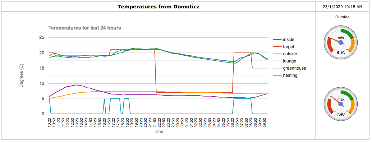
For some time I had been looking for a way to produce a rolling, 24-hour composite graph showing multiple temperatures from Domoticz. Sure, you can create a Custom Graph from within the Temperatures tab in Domoticz, but this does not appear to be persistent, i.e., you need to create it every time you want to see it.
I then came across Google Charts, which has enabled me to produce such a graph in a separate webpage in my browser. Here's a sample:

.
Data file
To produce this, I created a csv file with data from Domoticz every 10 minutes. I used a python script which adds the latest data and drops off the oldest data every 10 minutes (cron), thus maintaining 144 rows (24 x 6 per hour) plus header. For my requirement, the file looks like this:
Code: Select all
now, inside, target, outside, lounge, greenhouse, heating
10:30,19.3,20.0,5.2,18.6,6.0,0
10:40,19.6,20.0,5.3,18.8,6.3,0
10:50,19.7,20.0,5.4,18.8,6.7,0
11:00,19.8,19.0,5.5,18.9,7.0,0
etc. (oldest data first)
However, the Python script seemed very clunky, and I asked (in this forum) if there was a better way of doing this in dzVents. @waaren kindly responded, and has created a dzVents script here:
https://www.domoticz.com/forum/viewtopi ... 72&t=30993
This approach is more elegant, and more tightly integrated with Domoticz.
You can have as many or as few data series as you want (but not too many - the graph will get very busy!) - just amend the devicenames / methods in the script (dataTable[1], etc.).
Script to create graphs
The script to create the graphs, in the form of an html file with Javascript code and Google Charts commands is here:
- Spoiler: show
Code: Select all
<html>

<head>
<meta charset="utf-8">

<title>Temperatures from Domoticz</title>

<script src="http://ajax.googleapis.com/ajax/libs/jquery/3.2.1/jquery.min.js"></script>
<script src="https://cdnjs.cloudflare.com/ajax/libs/jquery-csv/1.0.8/jquery.csv.min.js"></script>
<script type="text/javascript" src="https://www.gstatic.com/charts/loader.js"></script>

<script type="text/javascript"> // load the visualisation API

google.charts.load('current', { packages: ['corechart','gauge'] });
google.charts.setOnLoadCallback(drawTemps);
//google.charts.setOnLoadCallback(drawPower);

function drawTemps() {
   $.get("temps_daily.csv", function(csvString) {
      // transform the CSV string into a 2-dimensional array
      var arrayData = $.csv.toArrays(csvString, {onParseValue: $.csv.hooks.castToScalar});

      // this new DataTable object holds all the data
      var data = new google.visualization.arrayToDataTable(arrayData);

      // get min, max values for series 3 - change this for a different series (counting from 0)
      var range = data.getColumnRange(3);

      var options = {
        explorer: {},
        title: 'Temperatures for last 24 hours',
        titleTextStyle: {color: 'grey', fontSize: 16},
        hAxis: {title: 'Time', titleTextStyle: {bold: false, italic: false, color: 'grey'}, slantedTextAngle: 90, textStyle: {fontSize: 12}},
        vAxis: {title: 'Degrees (C)', titleTextStyle: {bold: false, italic: false, color: 'grey'}},
        seriesType: 'line',
        interpolateNulls: true,
      	};

      var chart = new google.visualization.LineChart(document.getElementById('temps_div'));
      chart.draw(data, options);

      var columns = [];
      var series = {};
      for (var i = 0; i < data.getNumberOfColumns(); i++) {
        columns.push(i);
        if (i > 0) {
            series[i - 1] = {};
        }
      };

      google.visualization.events.addListener(chart, 'select', function () {
        var sel = chart.getSelection();
        // if selection length is 0, we deselected an element
        if (sel.length > 0) {
            // if row is undefined, we clicked on the legend
            if (sel[0].row === null) {
                var col = sel[0].column;
                if (columns[col] == col) {
                    // hide the data series
                    columns[col] = {
                        label: data.getColumnLabel(col),
                        type: data.getColumnType(col),
                        calc: function () {
                            return null
                        }
                    };

                    // grey out the legend entry
                    series[col - 1].color = '#CCCCCC';
                }
                else {
                    // show the data series
                    columns[col] = col;
                    series[col - 1].color = null;
                }
                var view = new google.visualization.DataView(data);
                view.setColumns(columns);
                chart.draw(view, options);
            }
        }
      });

      var gauge_min_data = google.visualization.arrayToDataTable([
        ['Label', 'Value'],
        ['min', range.min]
      ]);

      var formatter = new google.visualization.NumberFormat(
    	{suffix: 'C', pattern: '##.#'}
	  );
	  formatter.format(gauge_min_data,1);

      var gauge_min_options = {
        width: 120, height: 120,
        min: -5, max: 35,
        redFrom: -5, redTo: 5,
        greenFrom: 15, greenTo: 25,
        yellowFrom: 25, yellowTo: 35,
        minorTicks: 5
      };

      var chart1 = new google.visualization.Gauge(document.getElementById('gauge_min_div'));
      chart1.draw(gauge_min_data, gauge_min_options);

      var gauge_max_data = google.visualization.arrayToDataTable([
        ['Label', 'Value'],
        ['max', range.max]
      ]);

	  formatter.format(gauge_max_data,1);

      var gauge_max_options = {
        width: 120, height: 120,
        min: -5, max: 35,
        redFrom: -5, redTo: 5,
        greenFrom: 15, greenTo: 25,
        yellowFrom: 25, yellowTo: 35,
        minorTicks: 5
      };

      var chart2 = new google.visualization.Gauge(document.getElementById('gauge_max_div'));
      chart2.draw(gauge_max_data, gauge_max_options);

    },'text');

}


function GetClock(){
	var d=new Date();
	var nmonth=d.getMonth(),ndate=d.getDate(),nyear=d.getFullYear();
	var nhour=d.getHours(),nmin=d.getMinutes(),ap;

	if(nhour==0){ap=" AM";nhour=12;}
	else if(nhour<12){ap=" AM";}
	else if(nhour==12){ap=" PM";}
	else if(nhour>12){ap=" PM";nhour-=12;}

	if(nmin<=9) nmin="0"+nmin;

	document.getElementById('clockbox').innerHTML=""+ndate+"/"+(nmonth+1)+"/"+nyear+" "+nhour+":"+nmin+ap+"";
}

window.onload=function(){
	GetClock();
	setInterval(GetClock,1000);
	setInterval(drawTemps, 60000);
//	setInterval(drawPower, 60000);
}

</script>

<style>
	table, th, td {
    	border: 2px solid #ccc;
    	border-collapse: collapse;
    	font-family: verdana;
    	font-size: 16px
	}
	th, td {
    	padding: 5px;
    	text-align: center;
	}
	td {
		font-size: 12px
	}
	.graph {
  		width: 1000;
  		height: 400;
	}
	.meter {
  		padding: 15px;
  		width: 130;
  		height: 150;
  		font-size: 14px;
	}
</style>

</head>

<body>

<table>
  	<tr>
		<th>Temperatures from Domoticz</td>
		<td><div id="clockbox" style="font-size: 100%"></div></td>
  	</tr>
  	<tr>
		<td rowspan = "2"><div id="temps_div" class="graph"></div></td>
		<td>Outside<div id="gauge_min_div" class="meter"></div></td>
  	</tr>
  	<tr>
  		<td><div id="gauge_max_div" class="meter"></div></td>
  	</tr>

</table>

</body>

</html>
In terms of customisation, you only need to change line 19 for the name of your csv file (and see below, re webserver). However, there are also gauges in the chart, which show the minimum and maximum values for data series 3 - you can change this at line 27.
You can hover over any series, and Google Charts will display values in tooltips.
There is a GetClock function within the script, which updates the webpage every 10 minutes (as data is only updated at the same rate).
Webserver
To display the graphs, I set up a webserver using nginx - see instructions for Raspberry Pi here:
https://www.raspberrypi.org/documentati ... r/nginx.md
I created a separate www folder, and saved the above chart script as index.html inside it. I also changed the location / name of the csv file in the dzVents script so that it creates the csv file within this folder. As per the nginx instructions, I changed the location of the webpage in /etc/nginx/sites-available/default.
So, in my setup I have created a folder /home/pi/devices/www, which contains:
The output line in the dzVents script is changed to:
Code: Select all
local output = '/home/pi/devices/temps_daily.csv' -- location/name of your csv text file
and the webpage location in /etc/nginx/sites-available/default is changed to:
I apologise if this seems very long-winded - I will try and produce a TL;DR; version!
Anyway, if you find this useful or if you have any queries, please let me know.
 .
.